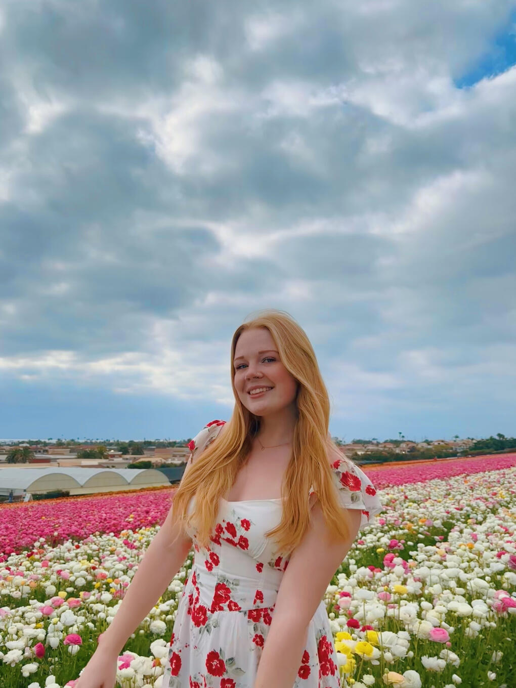
ERIN HARWOOD
Click the buttons to navigate!
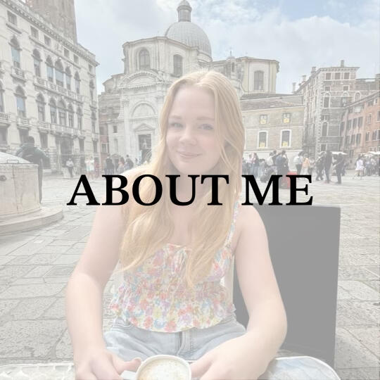
ABOUT ME
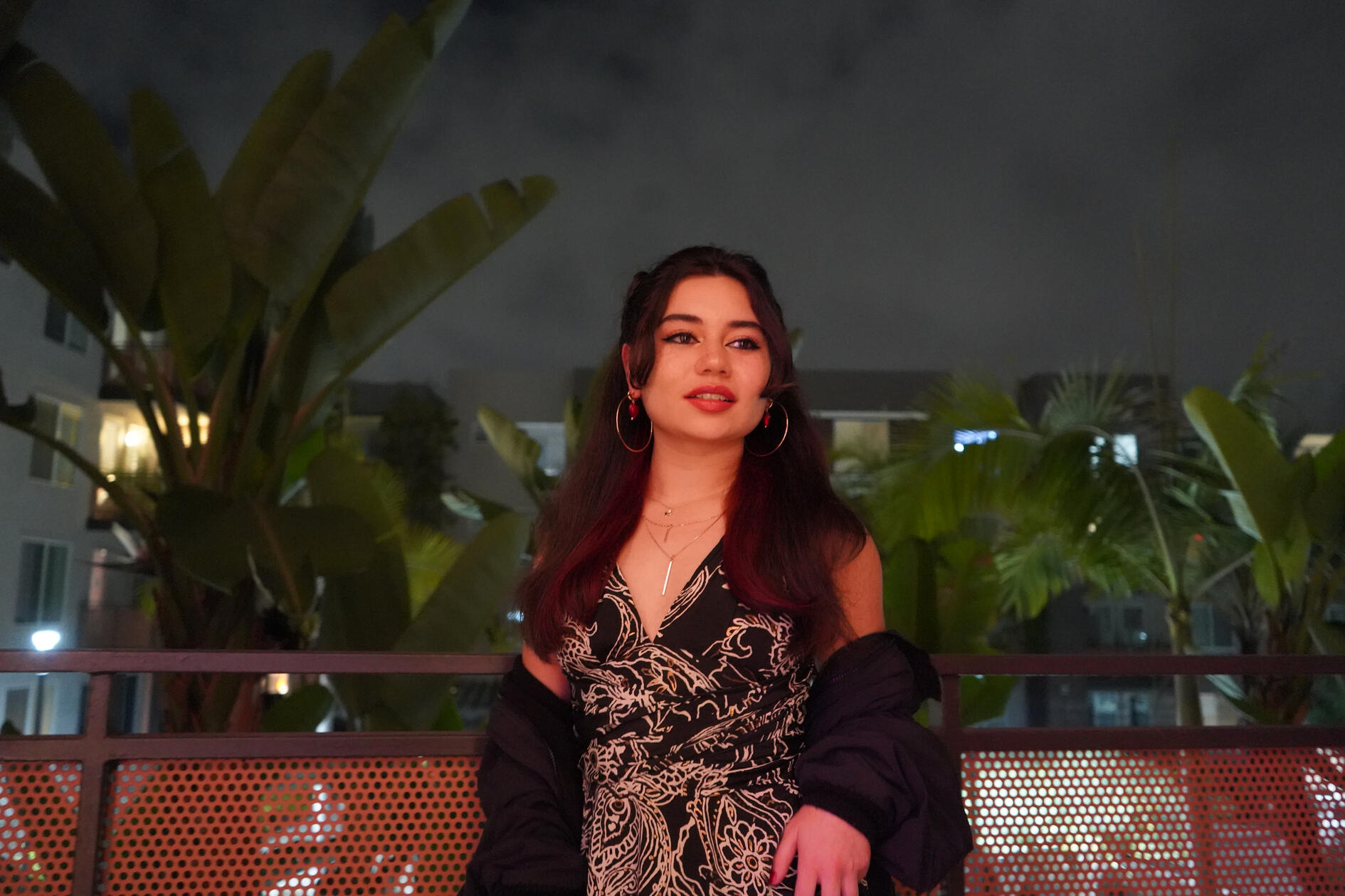
Hi! I'm Erin!
I'm a 21 year old graphic design student at San Diego State University. I am proficient in Adobe Illustrator & InDesign, and learning Photoshop. I am also proficient in several online free graphic design softwares, including Canva & Phonto, as well as basic video editing softwares like iMovie & CapCut. I am also currently learning Adobe Premiere Pro. I am also a photographer and am skilled in brush pen calligraphy, penmanship, and drawing, and I have social media marketing experience.My hobbies include record collecting, swimming, watching hockey (Go Avs!), getting a coffee, driving, and various arts & crafts.It's nice to meet you!
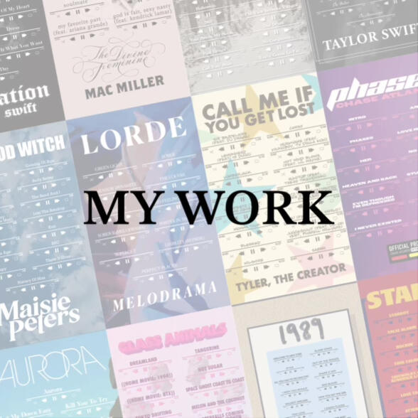
MY WORK
Click the buttons to navigate!
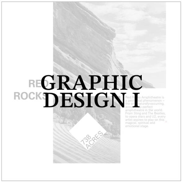
GRAPHIC DESIGN I
SPRING 2024 - PROFESSOR SCOTT WYSS
Click the buttons to navigate!
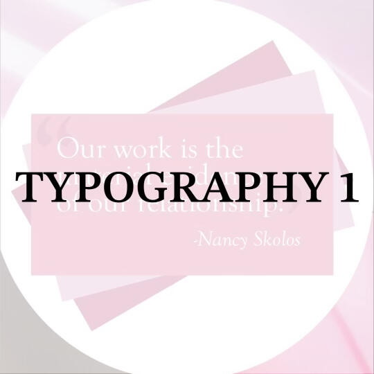
TYPOGRAPHY I
SPRING 2024 - PROFESSOR BETH WEEKS
Click the buttons to navigate!
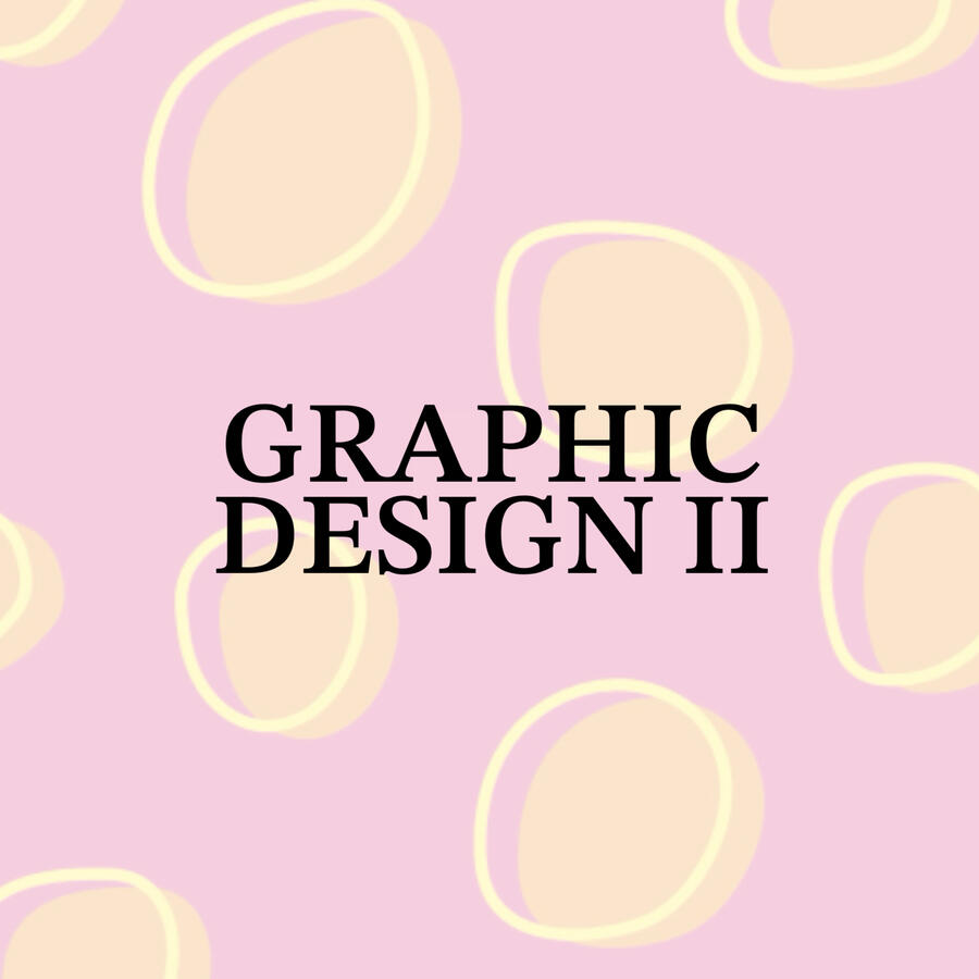
GRAPHIC DESIGN II
FALL 2024 - PROFESSOR ALLAN MANZANO
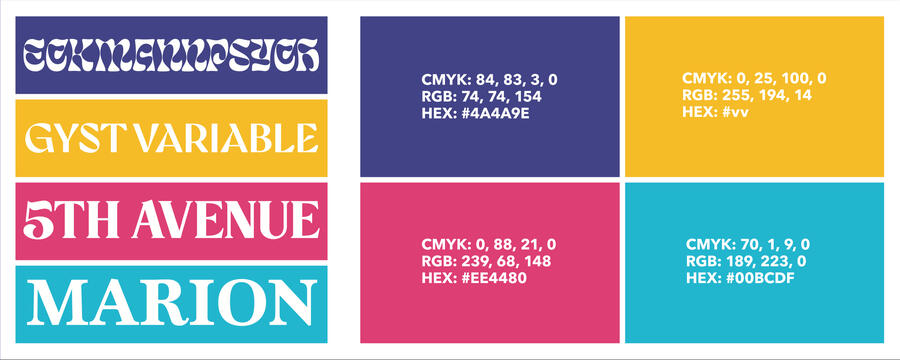
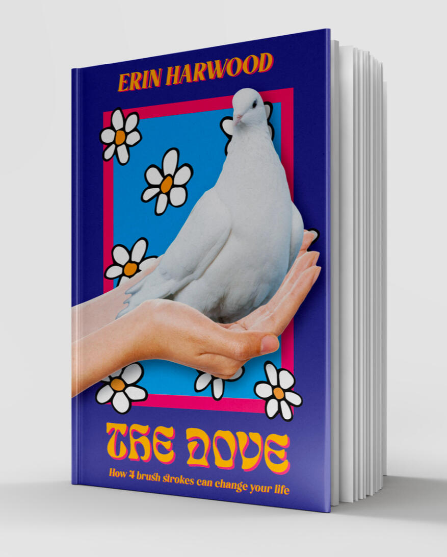
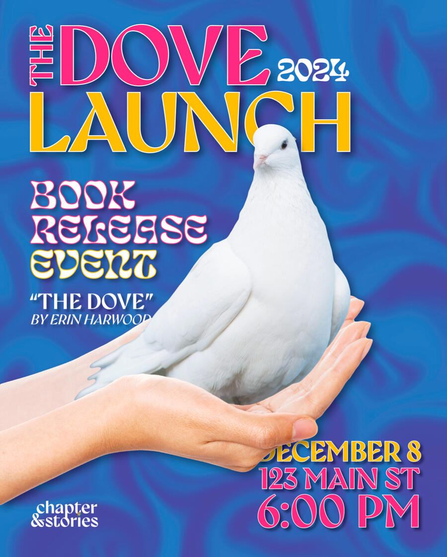
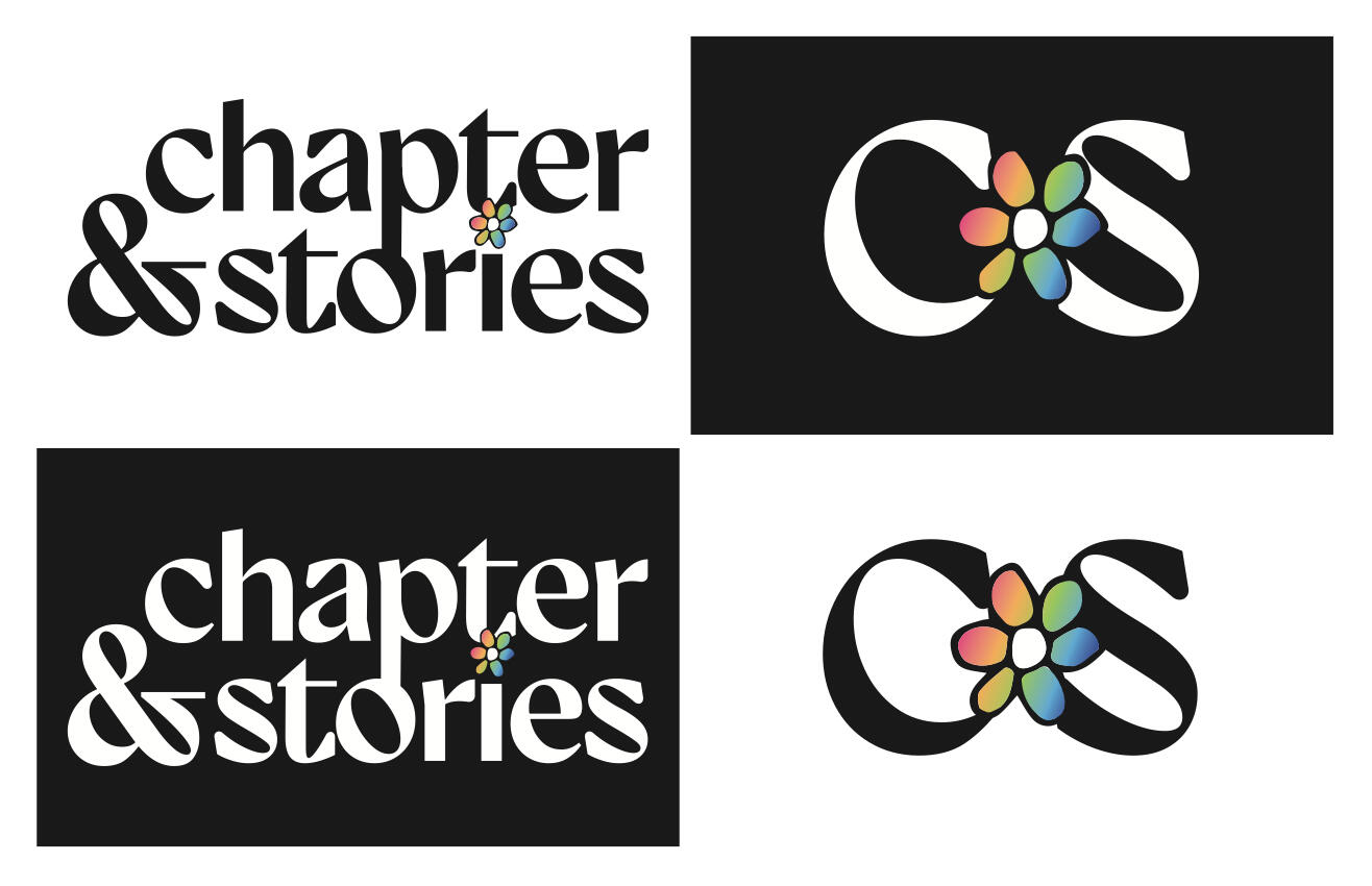
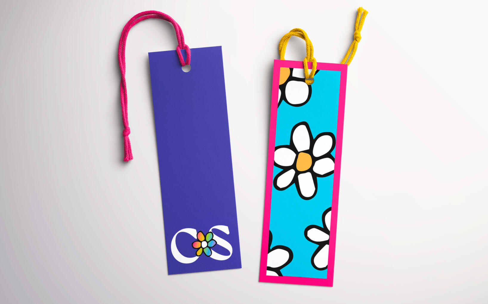
As opposed to multiple different projects, this class was essentially one 15 week project with lots of moving parts and deliverables to meant to simulate a real-world scenario and process of creating a brand identity.This project was all about creating a brand identity and using your voice within that identity. In this case, the brand is a publishing company called Chapters & Stories, and the voice is a cover for a personal autobiography. I wanted to create a brand identity that is just as creative as it is professional.
PROCESS
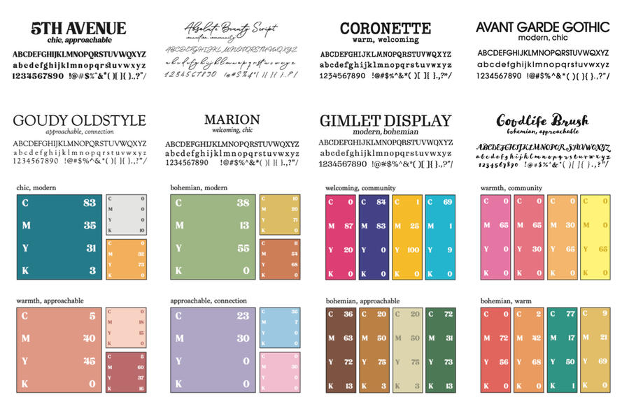
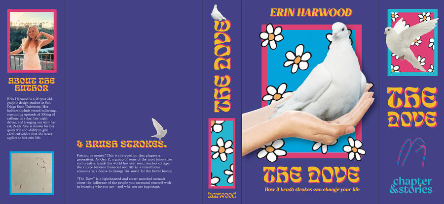
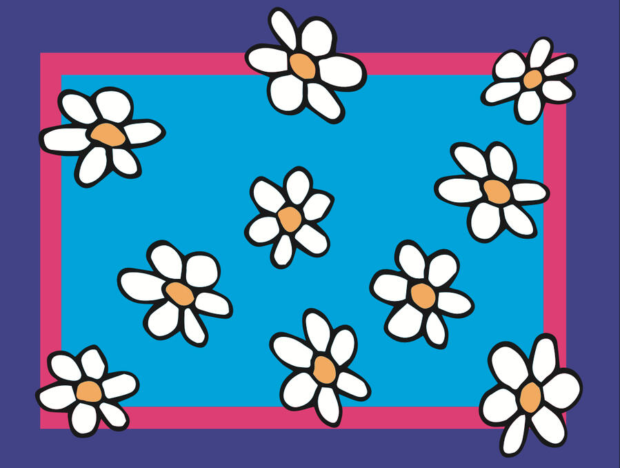
FINAL APPLICATION
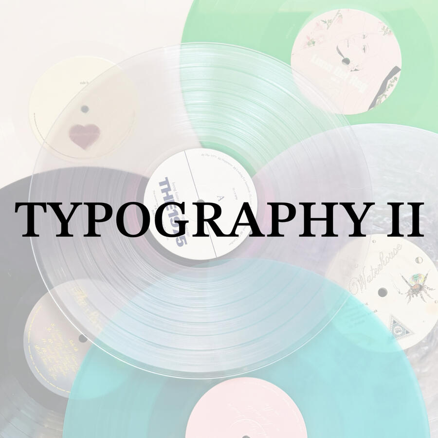
TYPOGRAPHY II
FALL 2024 - PROFESSOR JAMES BOWMAN
Click the buttons to navigate!
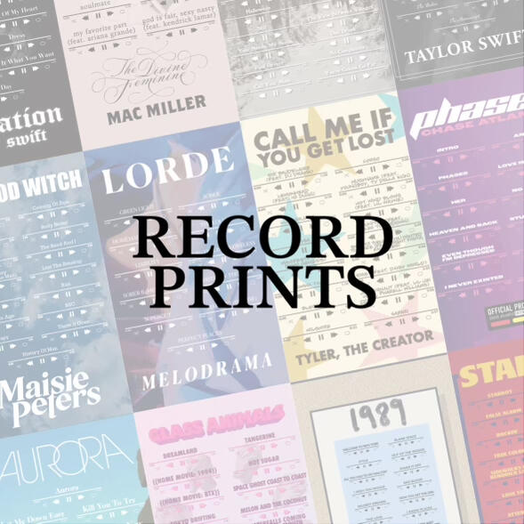
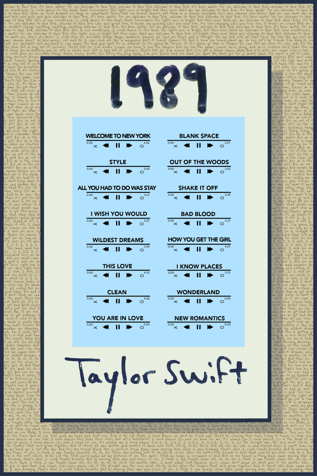
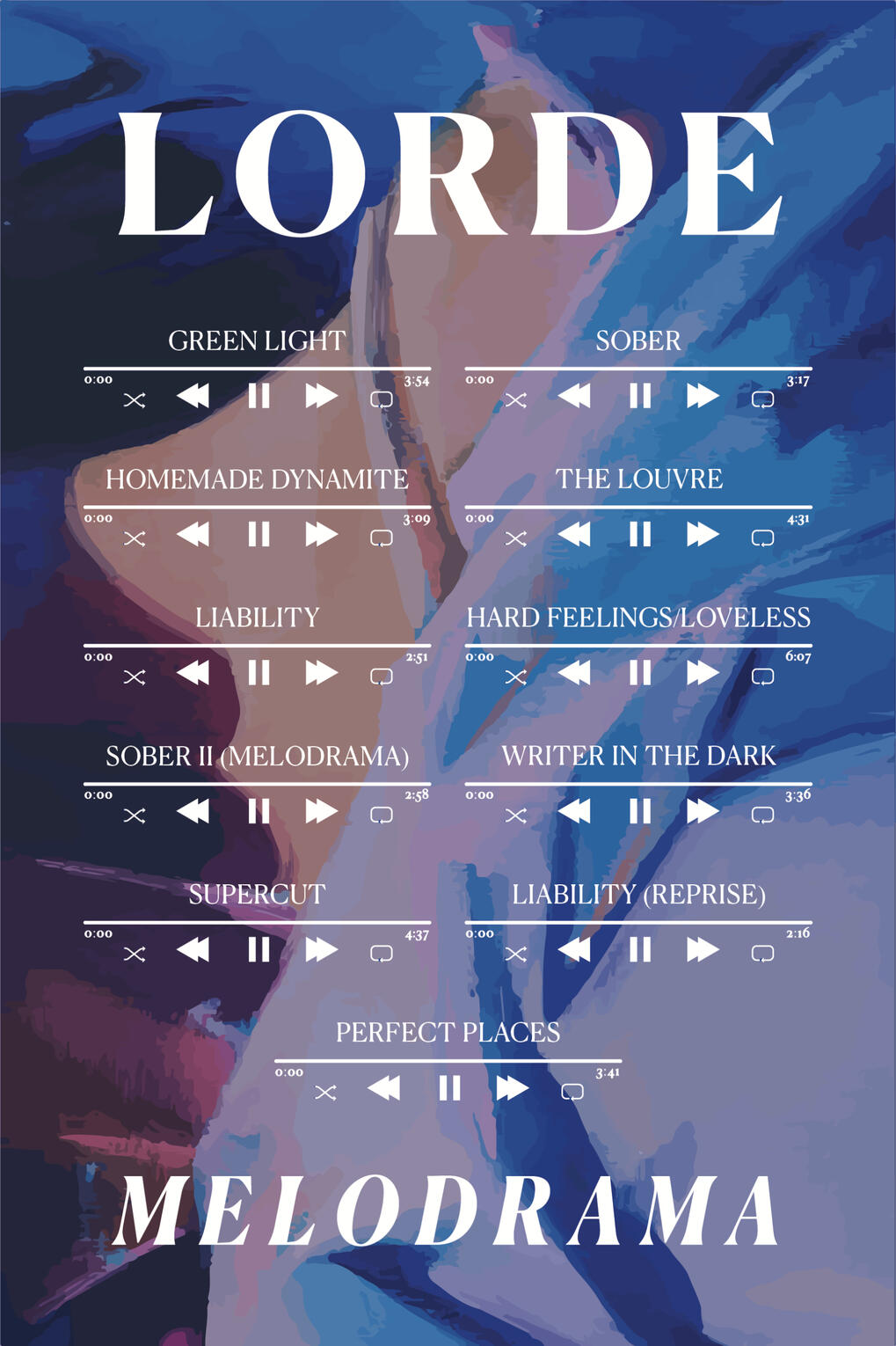
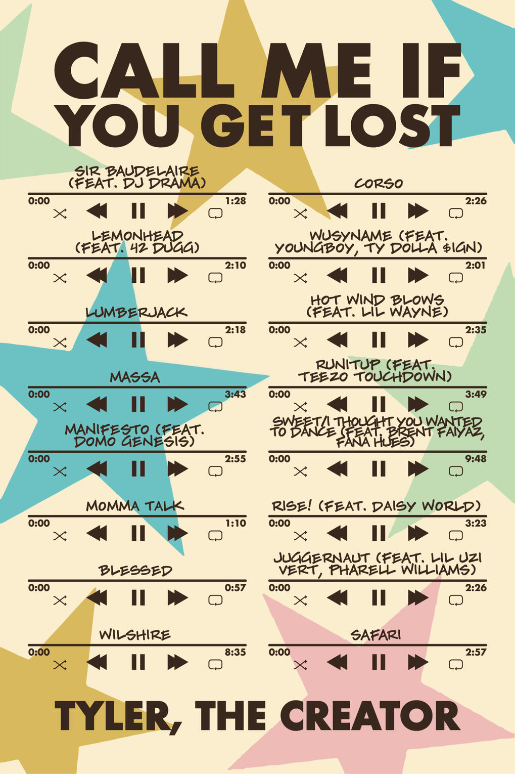
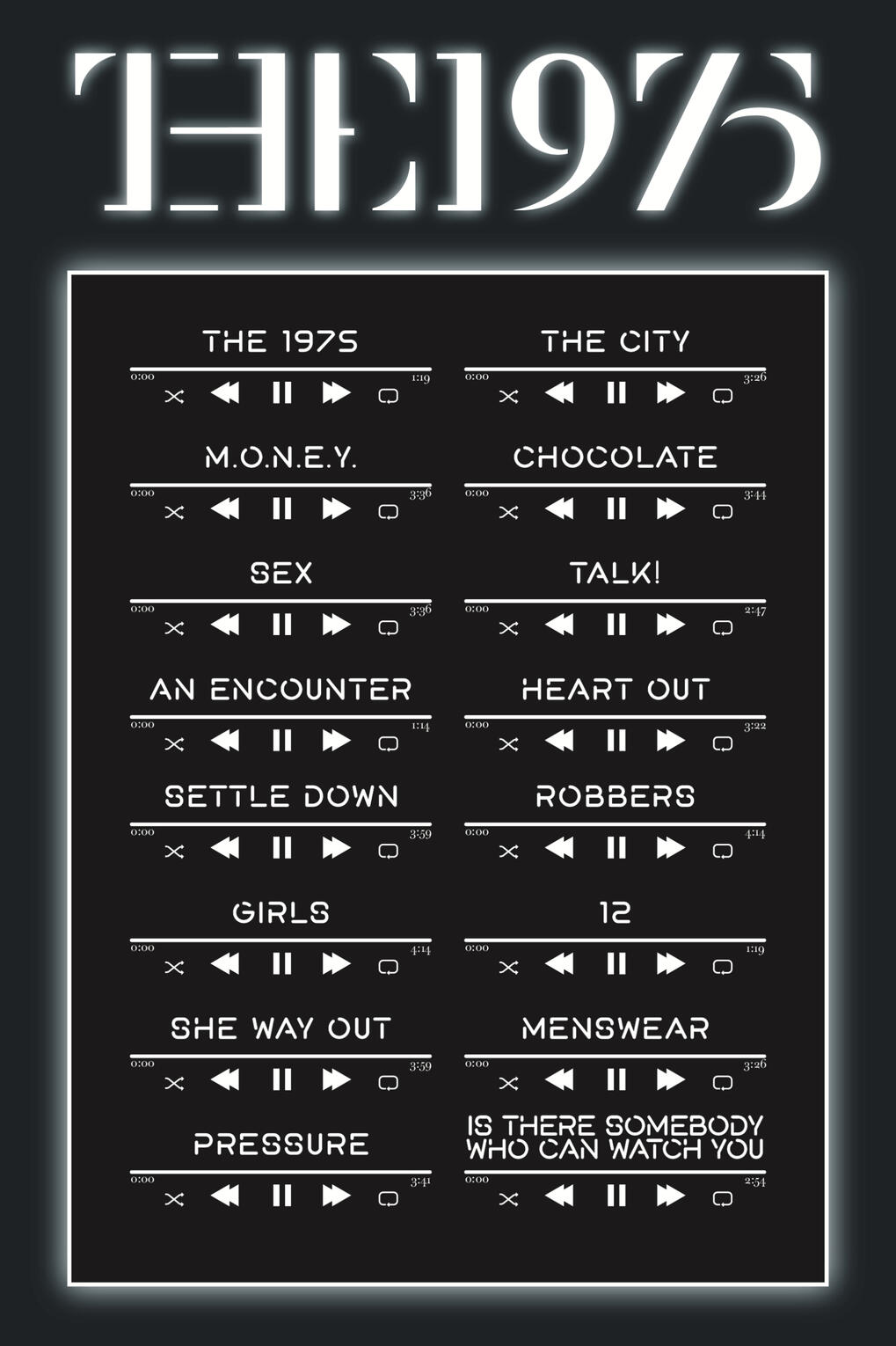
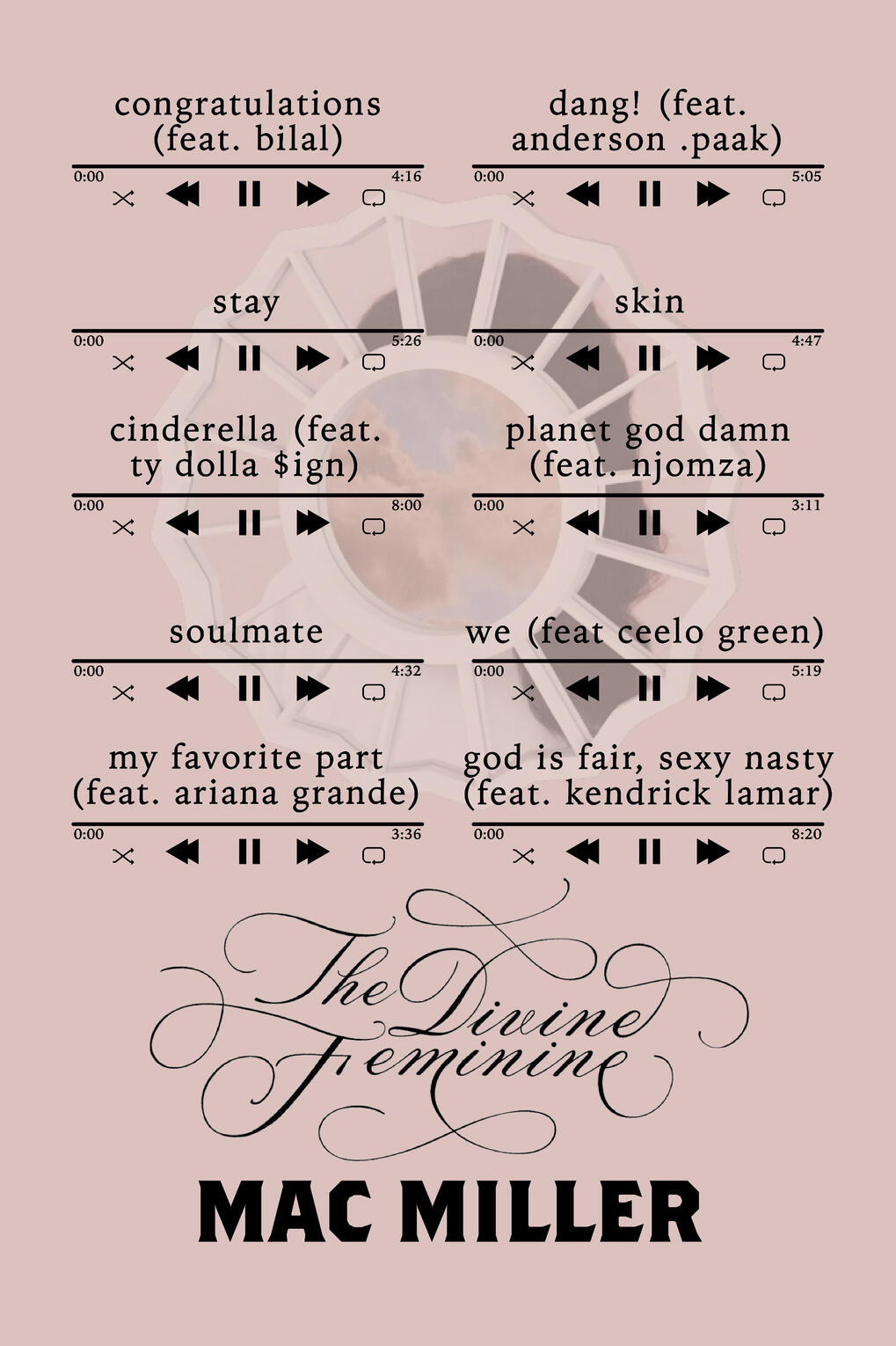
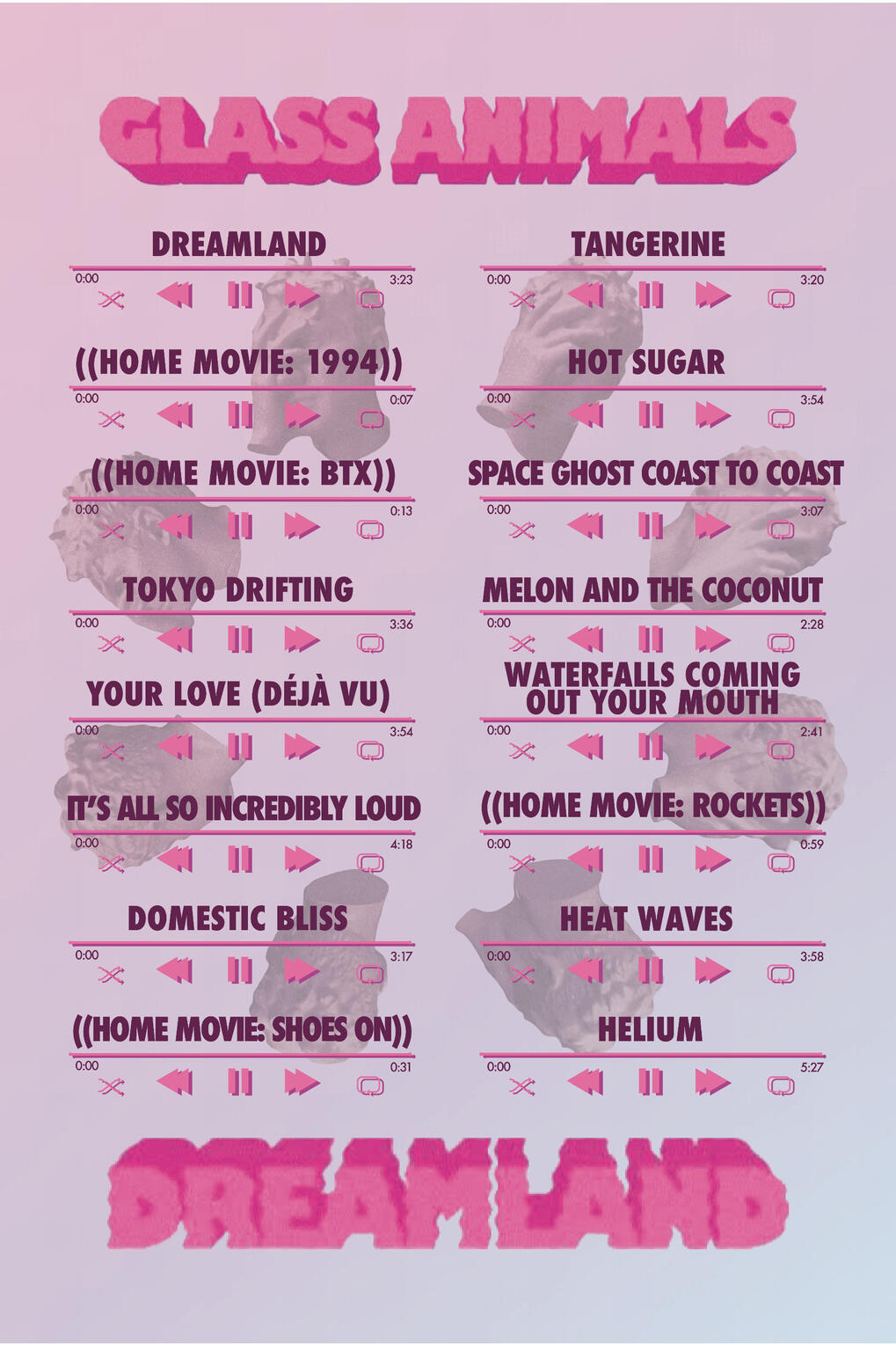
RECORD PRINTS
I started making album posters when I was looking for decorations for my bedroom. I didn't quite like any of the ones I was finding, so I made my own. Before I knew it, friends and friends of friends were asking me to make them albums too, and eventually I decided to share the love by opening an Etsy store. If you would like to buy or request your own, the link to my Instagram can be found at the bottom of this page!
pee pee
Below are my favorites, but I have made over 50 and am constantly making more!
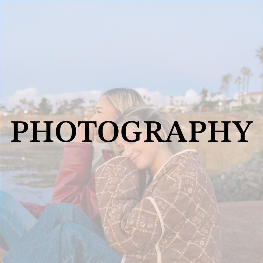
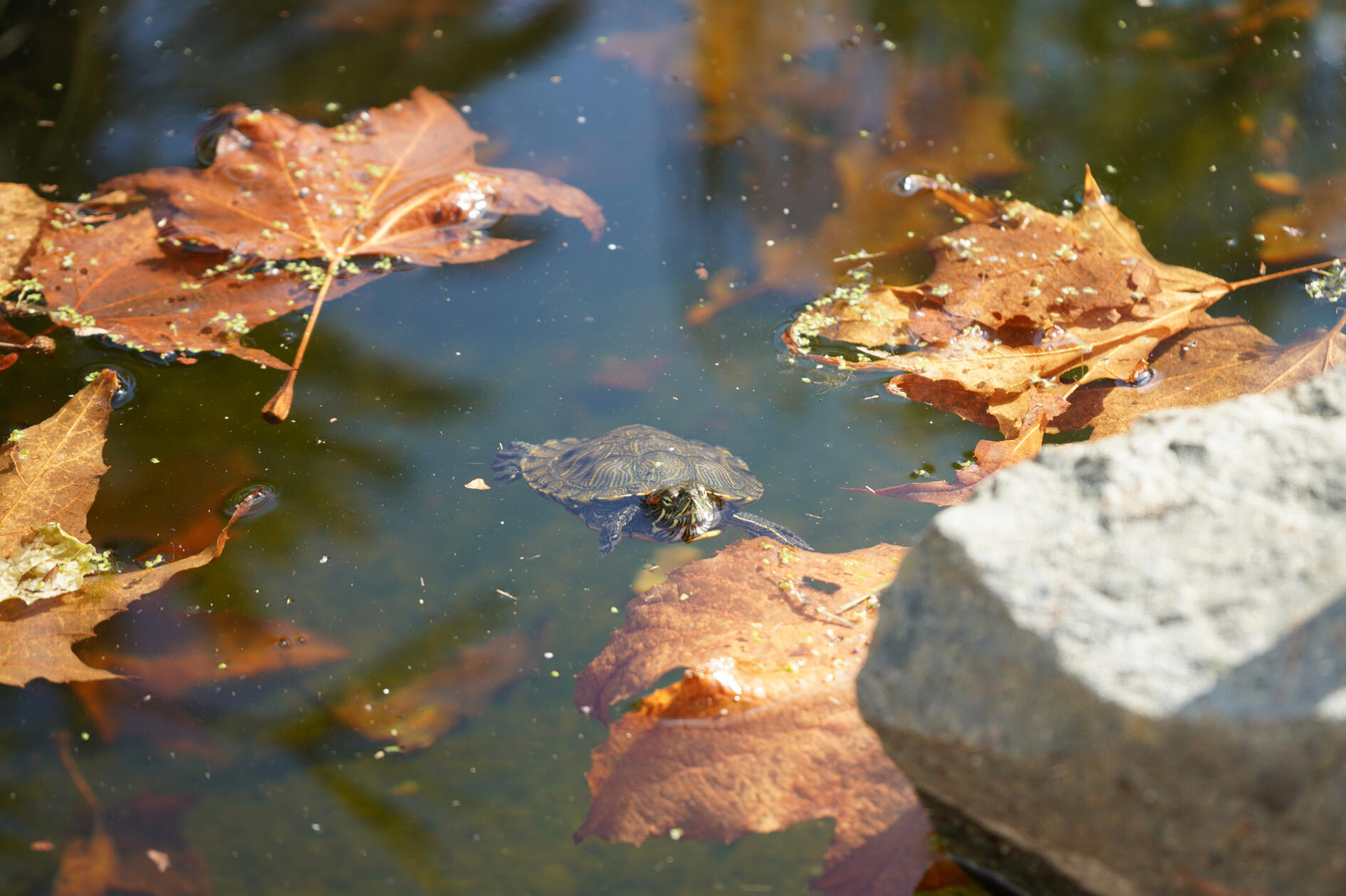
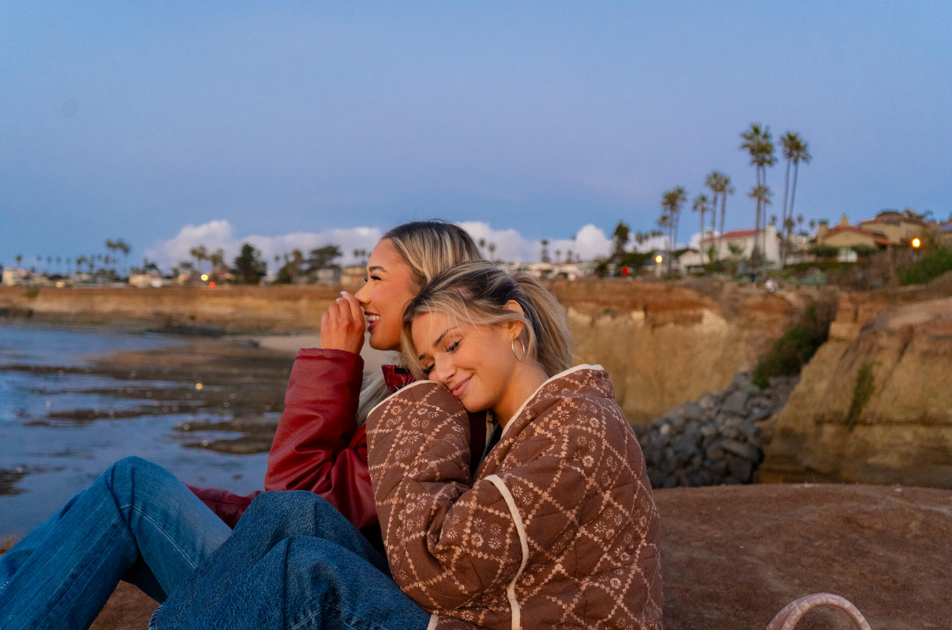
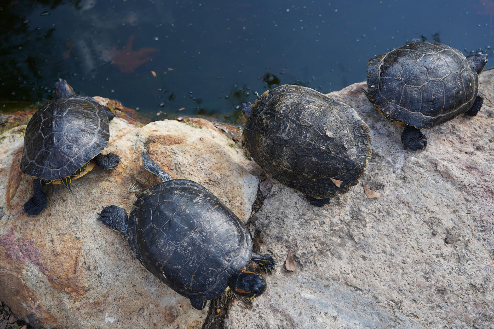
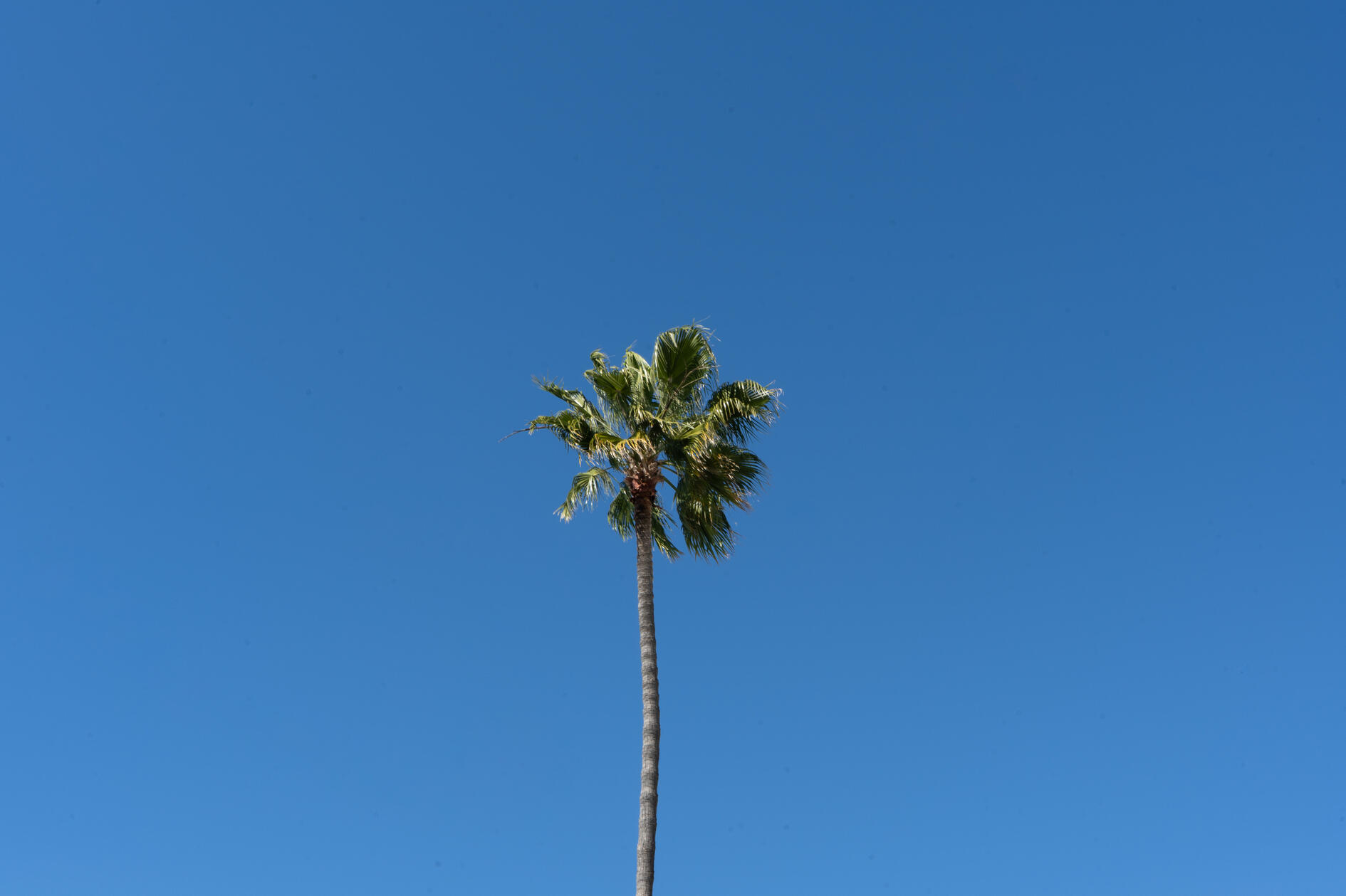
PHOTOGRAPHY
I have always enjoyed photography as an art/hobby, and I am currently taking digital photography courses at SDSU in hopes to become a professional quality photographer. These are my current best photos, I look forward to updating often as I hone the skill! I use a Sony a7iii.
pee pee
OTHER STUFF
BAND LOGOS
I am lucky enough to be friends with a lot of musicians, 2 of which I created logos for and helped run their social media accounts.
pee pee
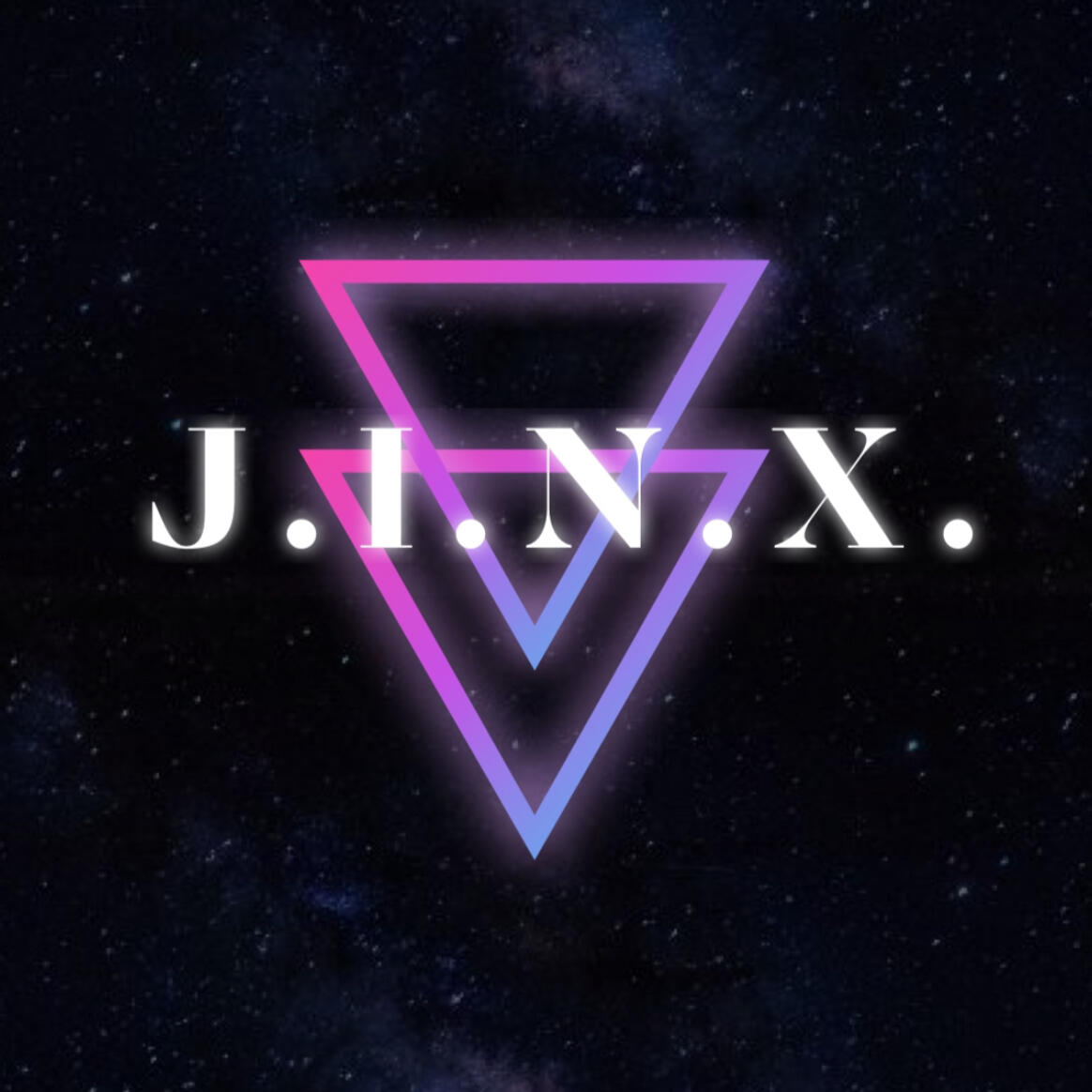
J.I.N.X
The first band, J.I.N.X mainly does covers but writes some of their own music. They play alternative rock and have a dark but colorful vibe to their sets. The lead singer (and my current roommate) Mazey Mills creates a stage presence that they describe as "alien, in a way". I used these observations to create a band logo that is unique to their identity as a band.
pee pee
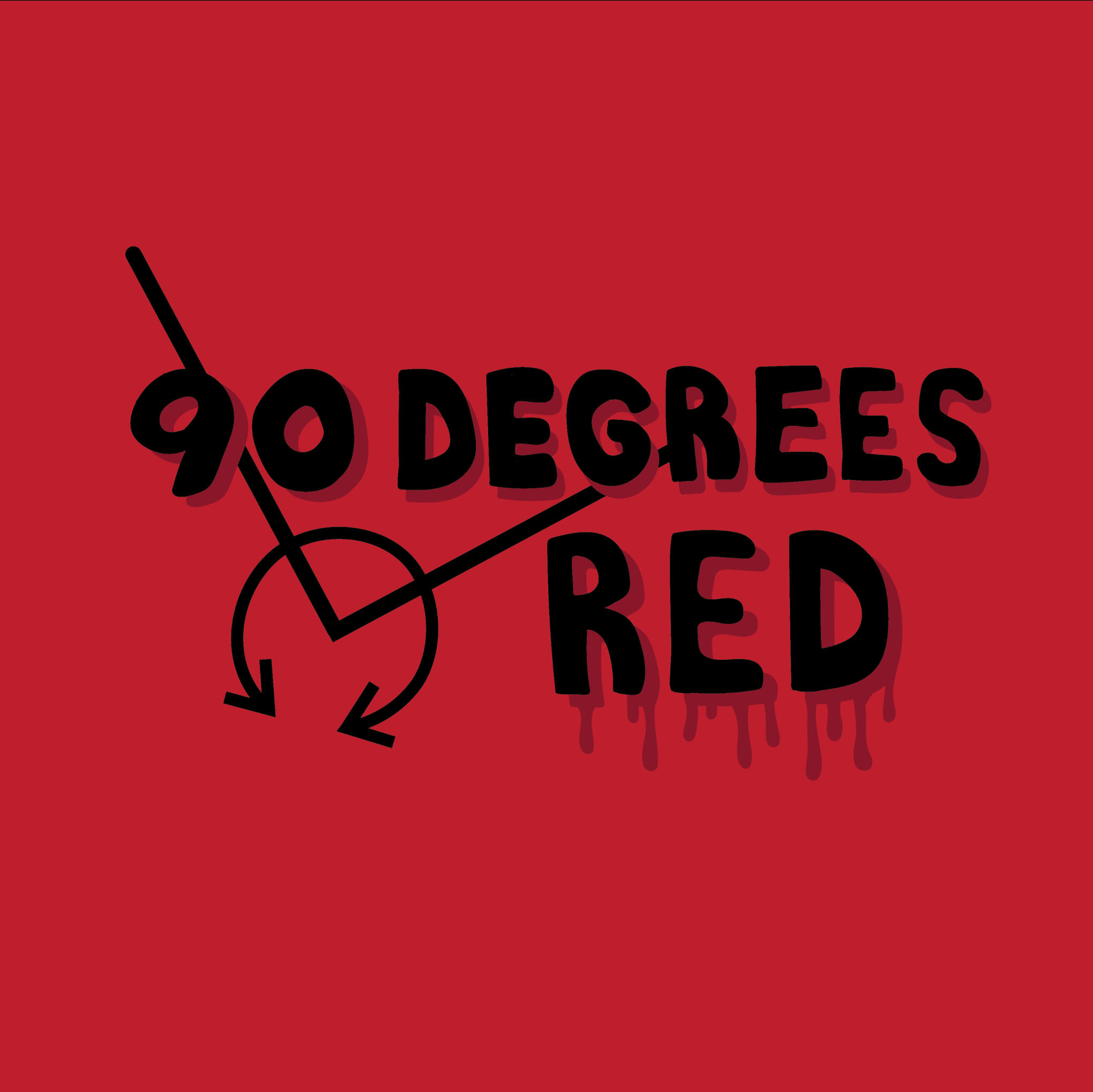
90 DEGREES RED
90 degrees red is an amateur rock band with electric guitar at the soul. The namesake is a phrase from my close friend and band member Alex Pruzinsky's childhood, and I created a logo that reflects this by using my own written block letters instead of a font. It is basic with room to grow in the future as the band continues to grow their identity.
pee pee
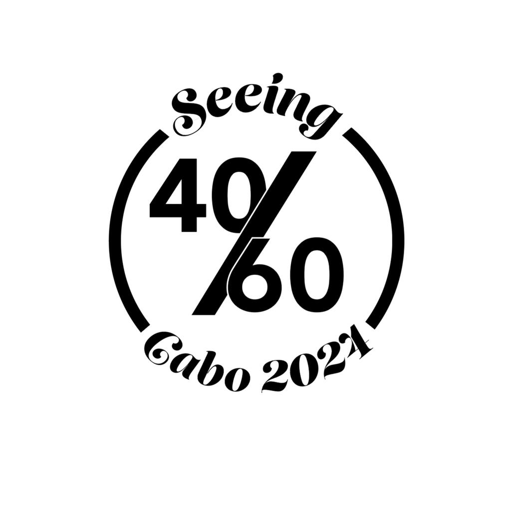
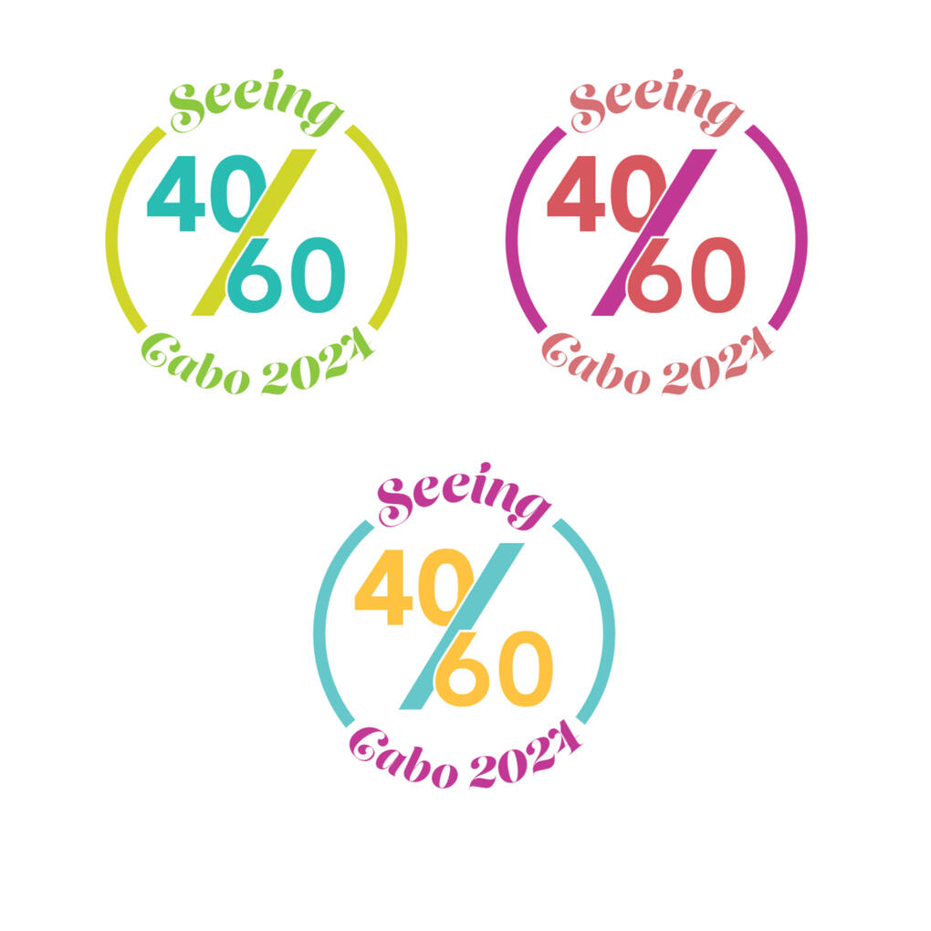
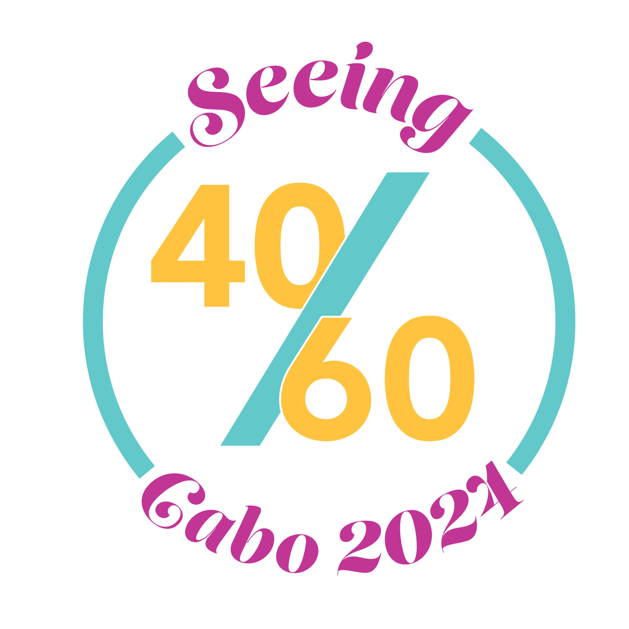
FREELANCE LOGO
A close family friend of mine took a trip to Cabo in June 2024 for a joint friend's birthday, and asked me to make a graphic logo for her to print on t-shirts for their trip. I went through multiple different black & white versions and eventually settled on a triadic color scheme, along with versions that work on both dark and light colored backgrounds.
pee pee
PROCESS
FINAL APPLICATION
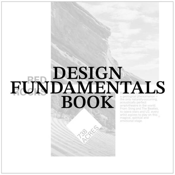
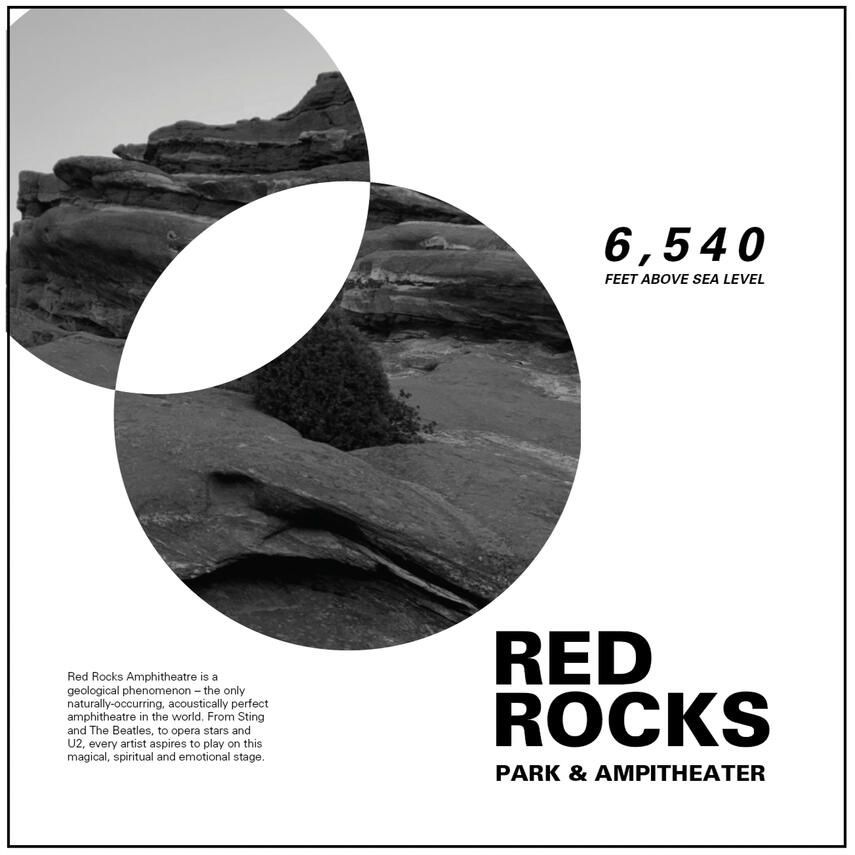
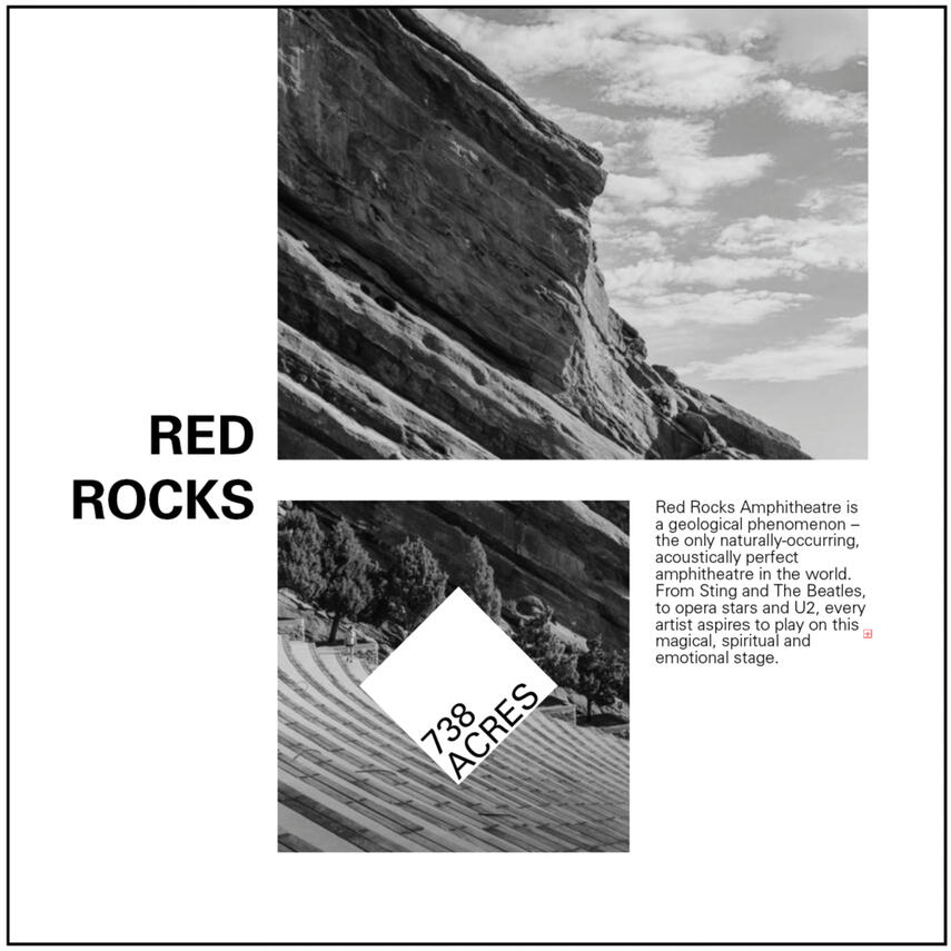
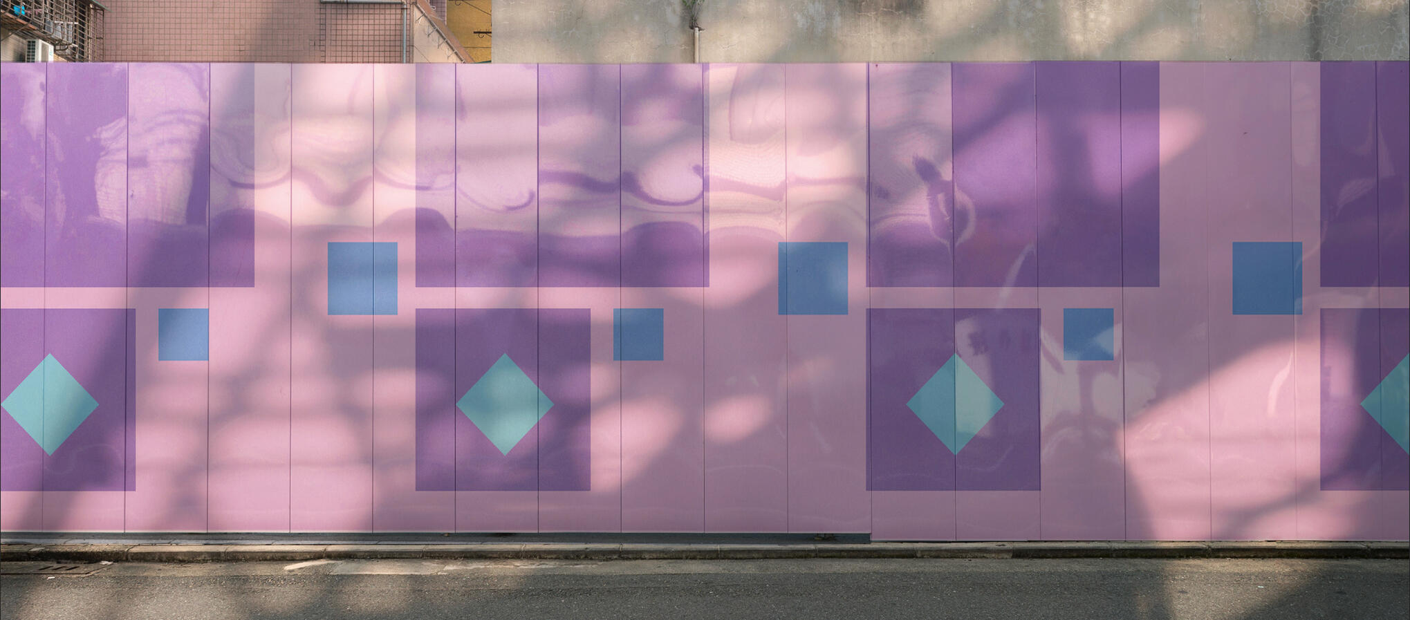
DESIGN FUNDAMENTALS BOOK
The design fundamentals book is meant to go back to basics, working with point line and plane to create dynamic layouts. With different sets of restrictions for each section I was required to challenge myself to think outside the box and create unique designs that then translated to the combination of type and image, where I used photos of Red Rocks Ampitheatre that I took myself.
pee pee
PROCESS
FINAL APPLICATION
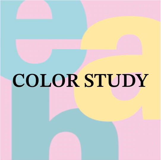
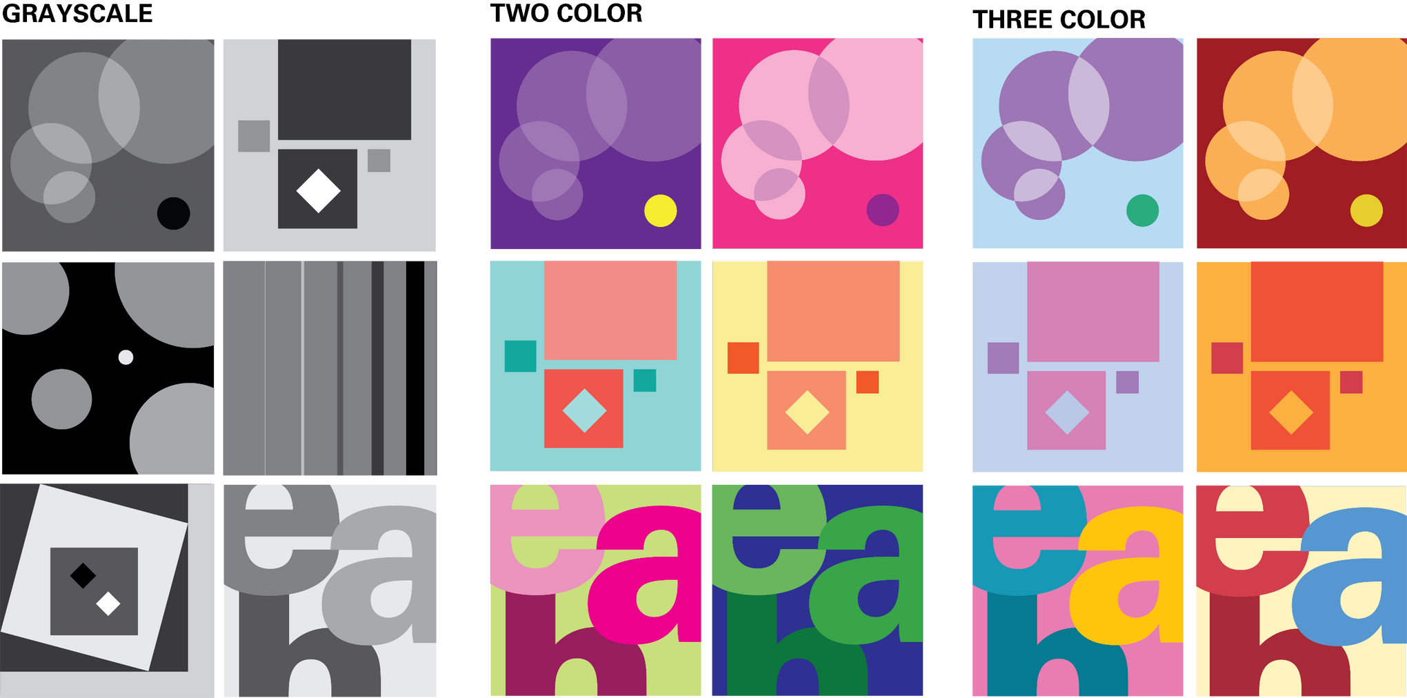
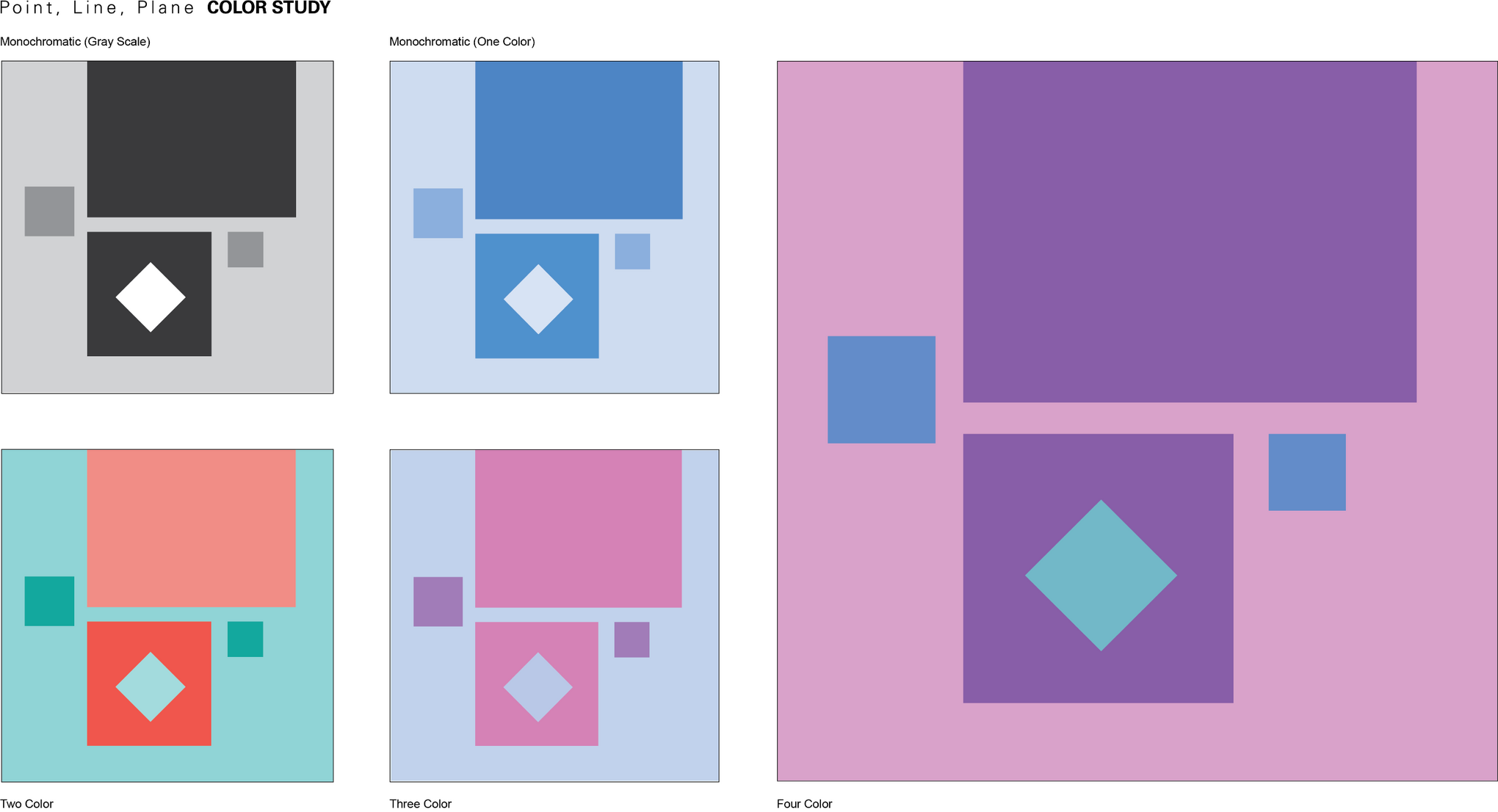
COLOR STUDY
the color study was meant to practice practical application of color in graphic design. I started by taking some of the original layouts from the Design Fundamentals project and adding color, starting with grayscale and working all the way up to triadic color schemes and using the CMYK process.
pee pee
PROCESS
FINAL APPLICATION
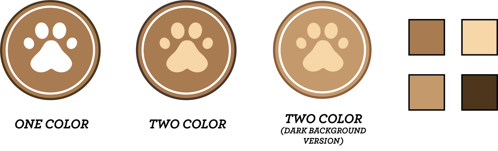
BRAND DESIGN
& PROFESSIONAL PRACTICES
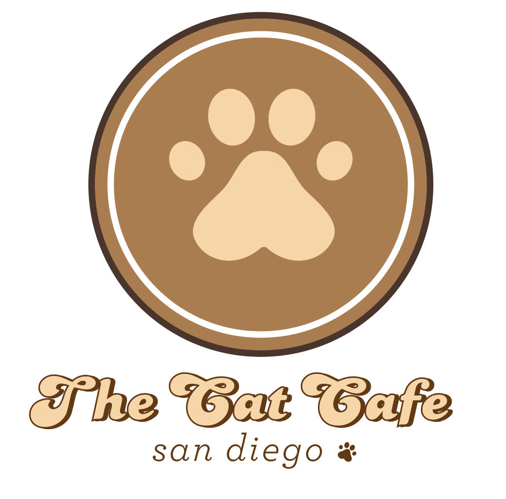
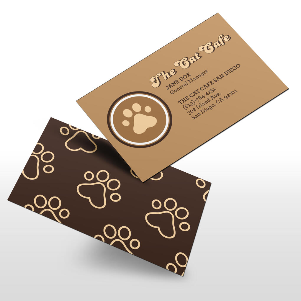
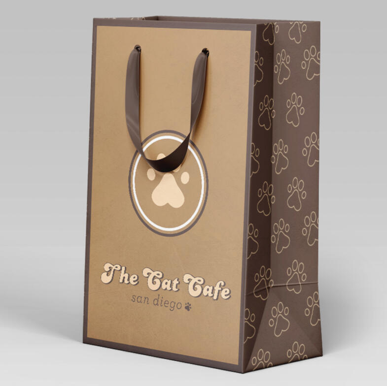
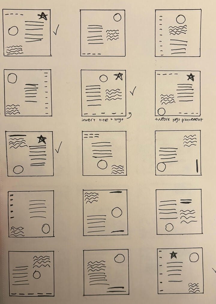
This project was all about logo design and finding brand identity. I knew I wanted to brand a cat cafe, one of my favorite business archetypes. I started with key words like coffee, paw, and latte art, and sketched with these words in mind to create a logo with multiple variations and patterns useable in many different applications. utilizing scale, color, and other elements I was able to put together a cohesive brand identity.
pee pee
PROCESS - SKETCHES

PROCESS - COLOR STUDY
FINAL APPLICATION
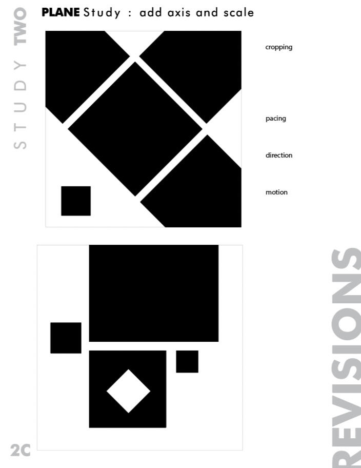
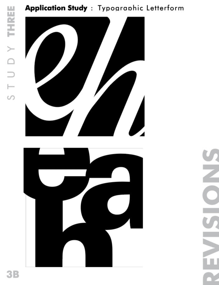
TYPE FUNDAMENTALS BOOK
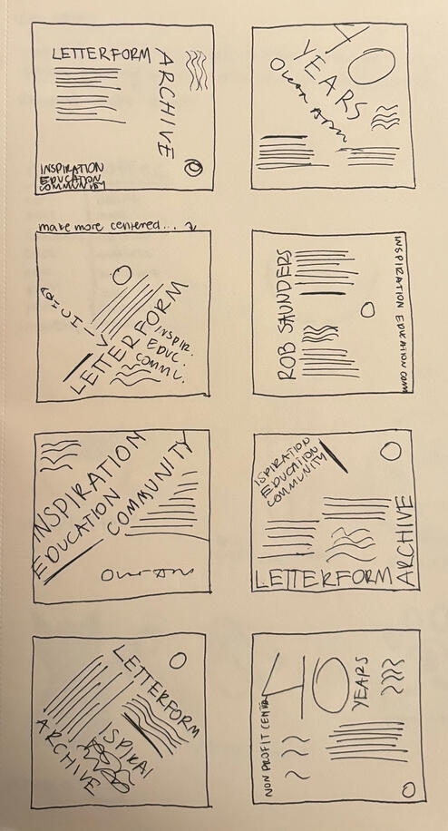
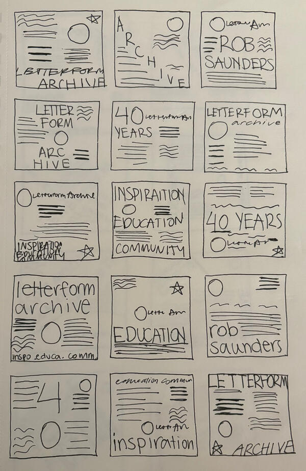
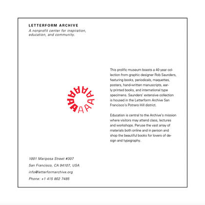
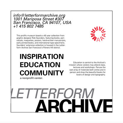
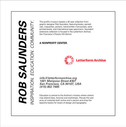
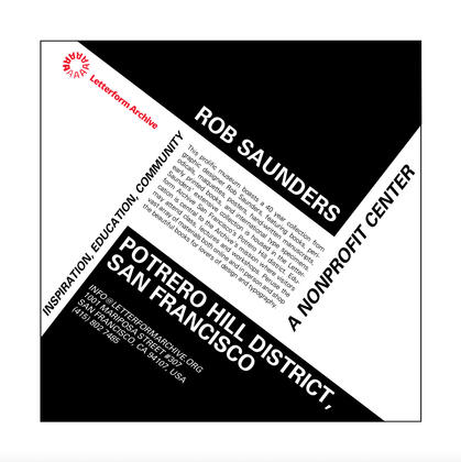
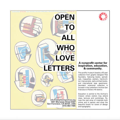
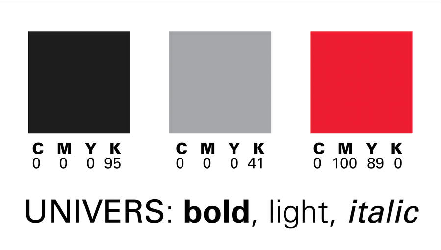
The Type Fundamentals Book was meant as an introduction to typography in design. Using Adobe InDesign, I explored how typography can affect composition by using the same text, obtained from Letterform Archive, and the Univers Font Family to create 25 different layouts starting by just arranging 10pt font into compositions and working up to color and image.
pee pee
PROCESS - SKETCHES
FINAL APPLICATION
in order - 10pt, scale, axis, graphic element, image
pee pee
pee pee
pee pee
MULTI-PAGE BOOK
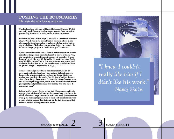
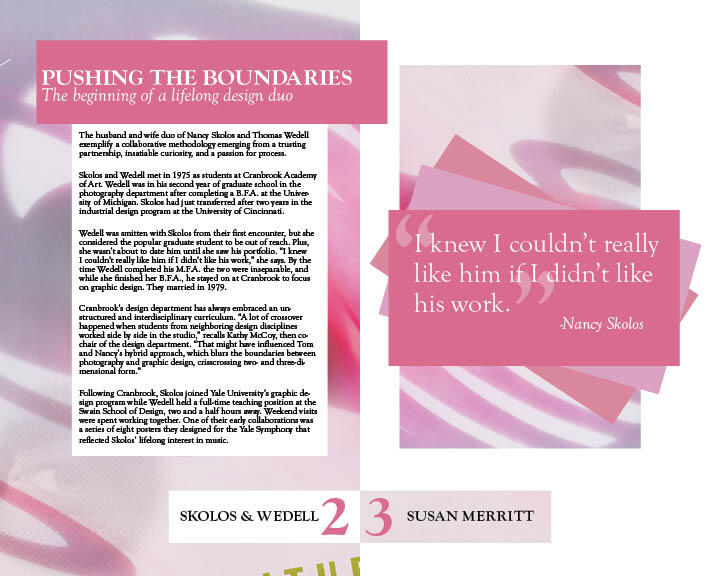
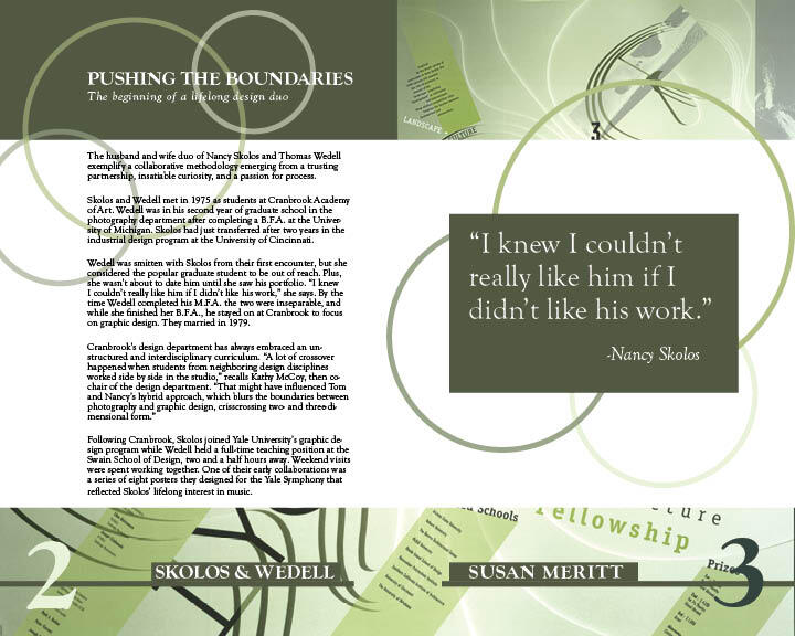
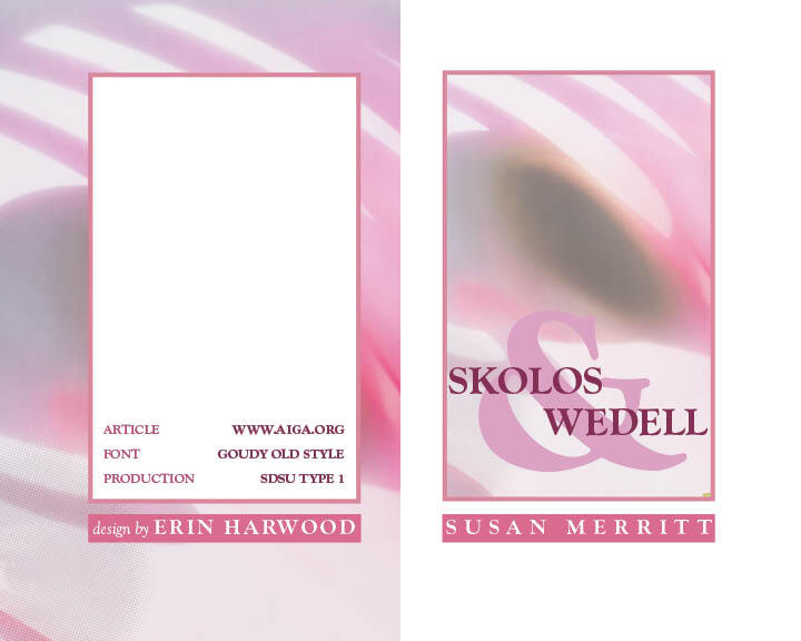
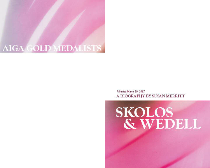
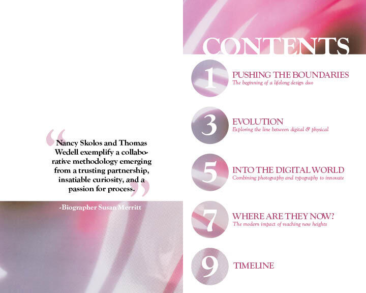
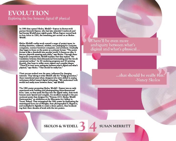
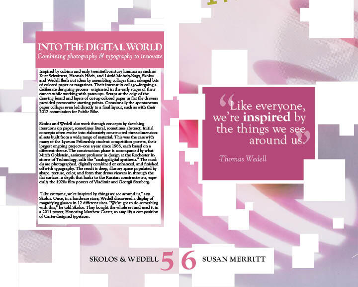
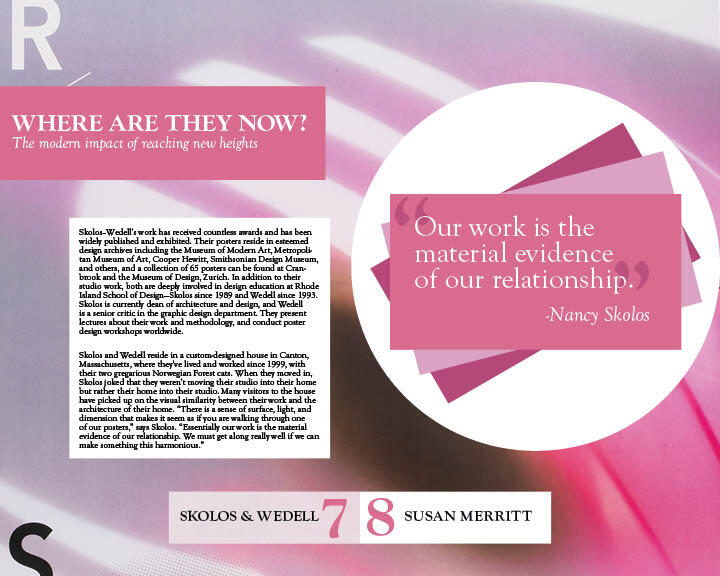
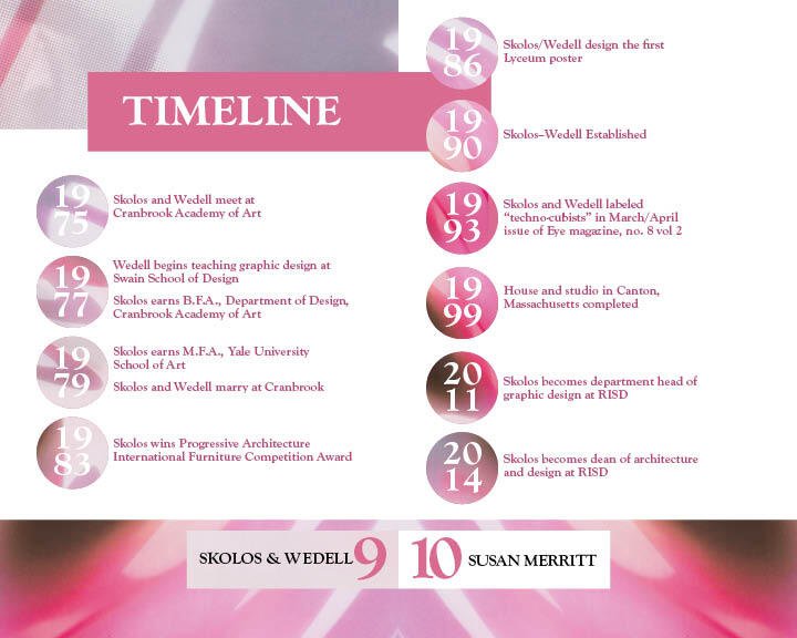
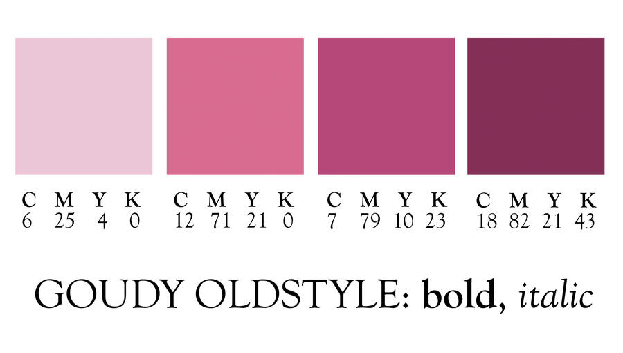
With the multipage book, I explored novel design and composed different layouts for a cover, title page, table of contents, body, and a timeline. The goal was to use the type fundamentals learned previously to create interesting hierarchy and a theme for a short book about graphic design duo Nancy Skolos and Thomas Wedell. I chose to use the Goudy Oldstyle font family for this project.
pee pee
PROCESS - COLOR & LAYOUT EXPLORATIONS
FINAL APPLICATION

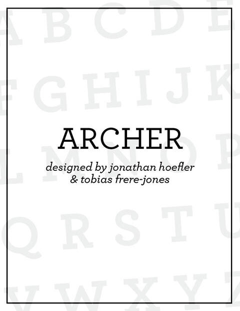
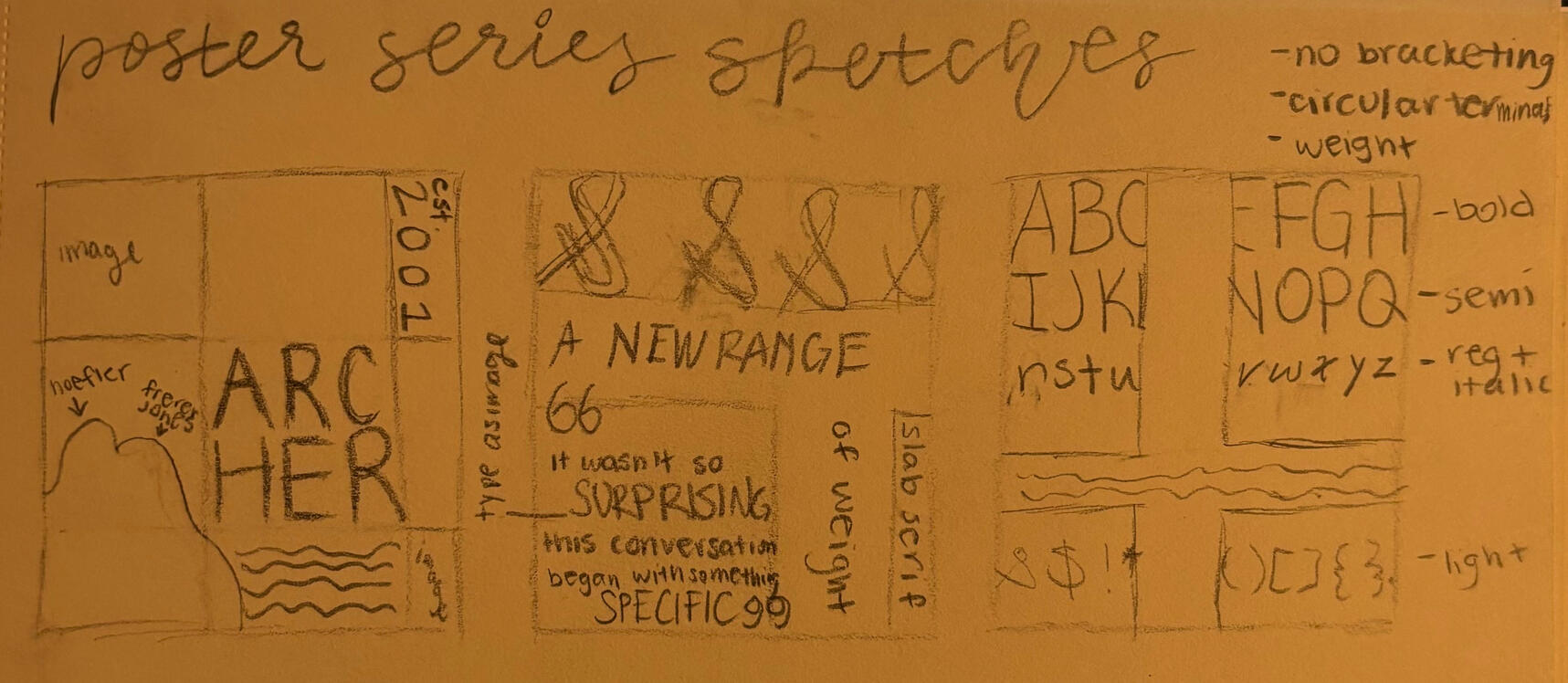
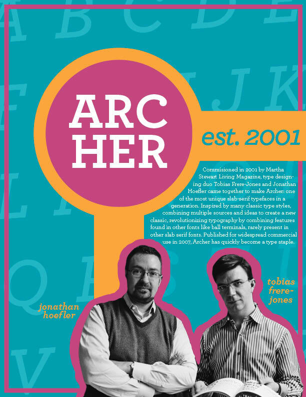
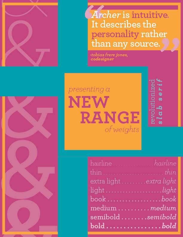
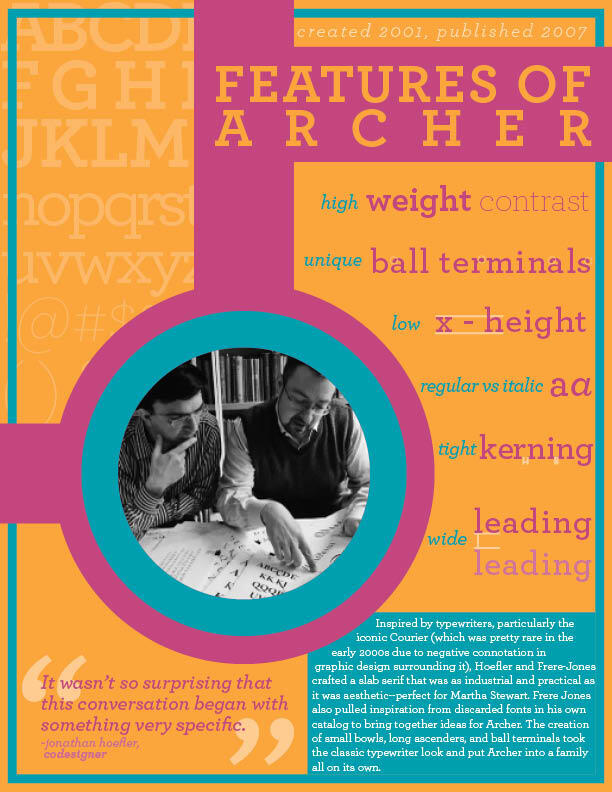
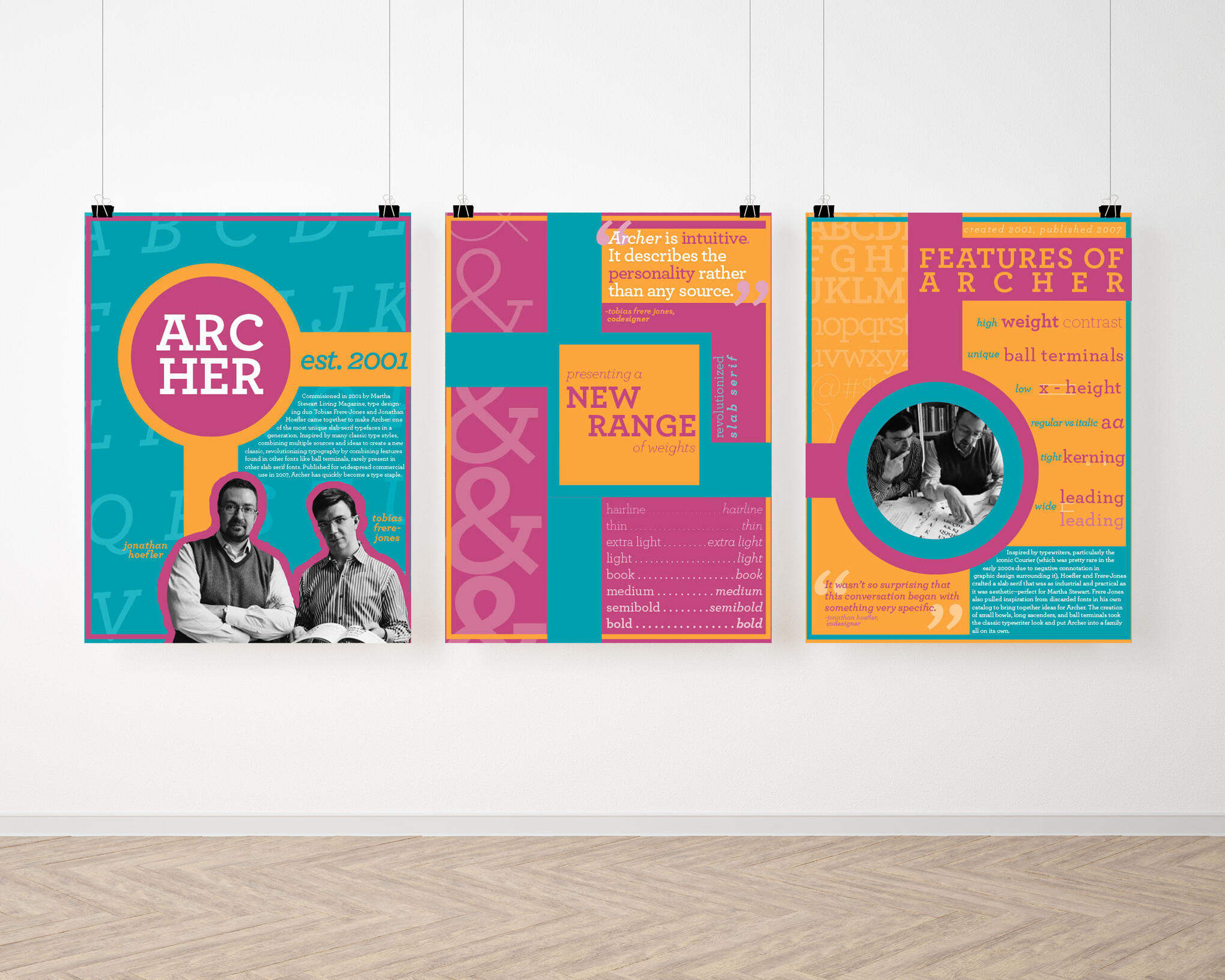
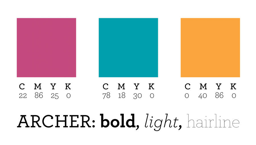
TYPOGRAPHER POSTER SERIES
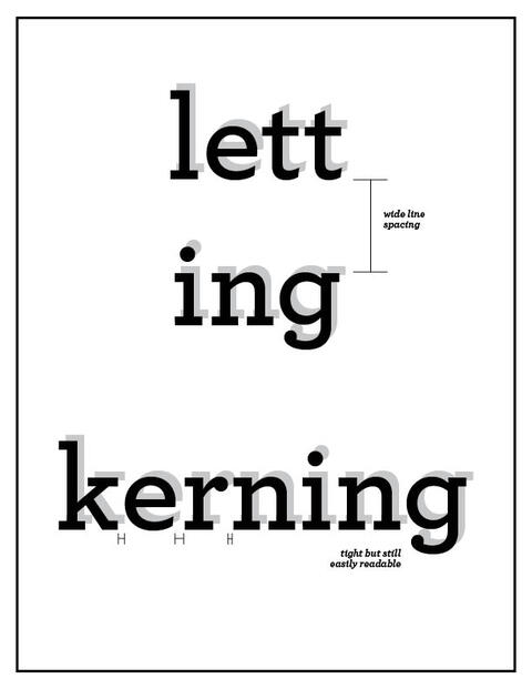
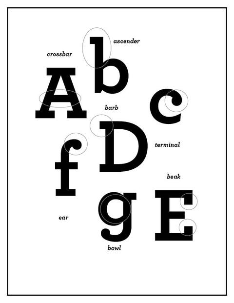
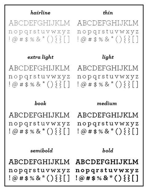
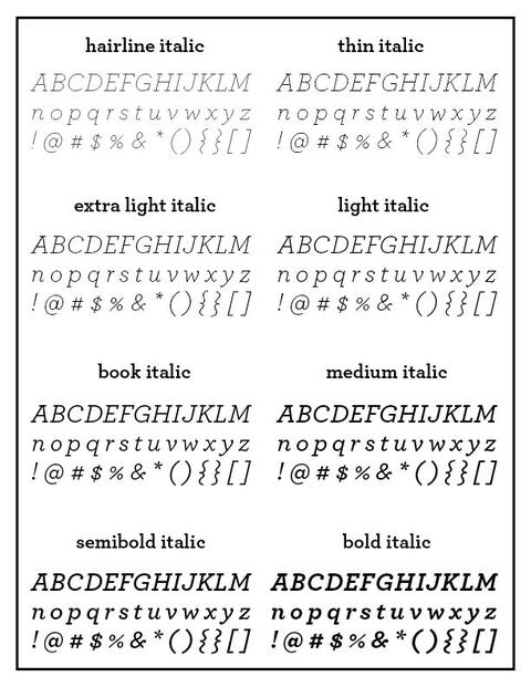
The Typographer Poster series was a project where I did a deep dive exploration on a font family and it's creators. For this, I chose the font Archer created by Tobias Frere-Jones and Jonathan Hoefler. Researching the font allowed me to study its features, characteristics, and practical uses and using this I created a compelling series of 3 posters that are unique but connect to each other.
pee pee
PROCESS - FONT STUDY
PROCESS - SKETCHES
FINAL APPLICATION
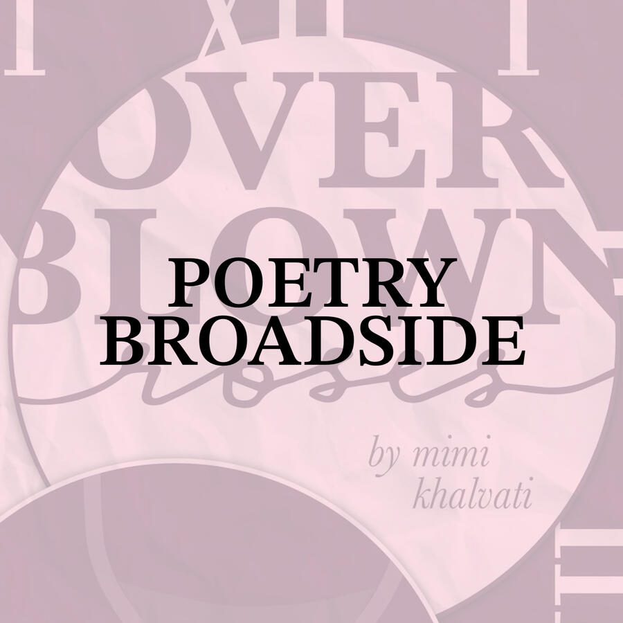
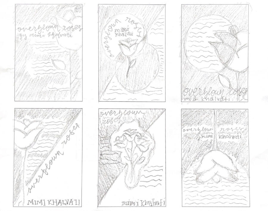
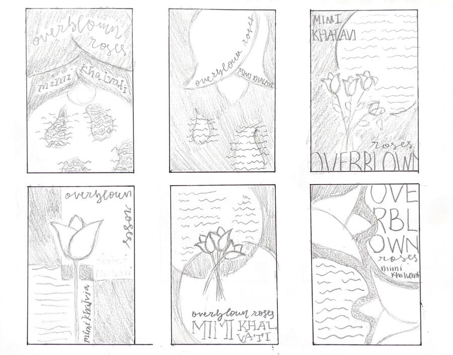
POETRY BROADSIDE
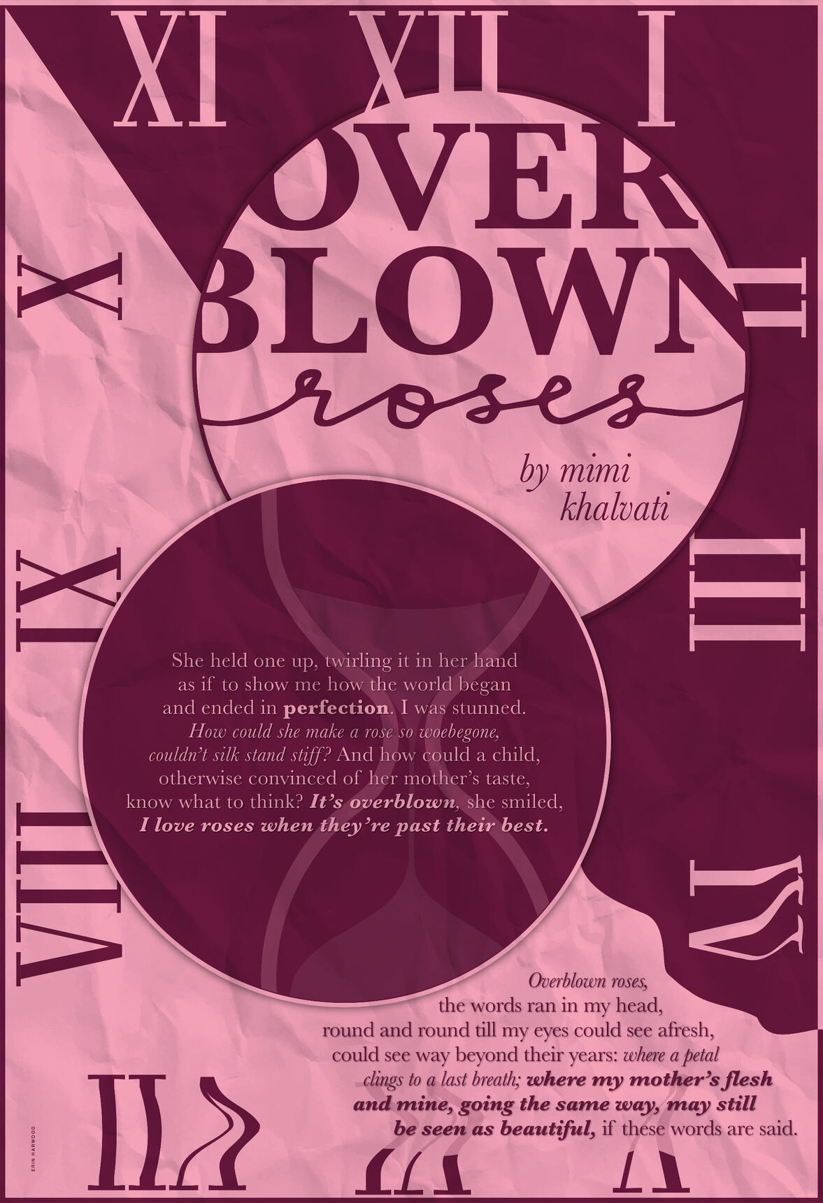
This project's focus was allowing large amounts of typography to harmonize with imagery in a non literal sense on a 9x13 poster. I chose the poem "Overblown Roses" by Mimi Khalvati, a poem about being comfortable in your own skin as you age, and used color, imagery, and graphic elements to convey the themes nonliterally.
pee pee
PROCESS - SKETCHES
FINAL APPLICATION
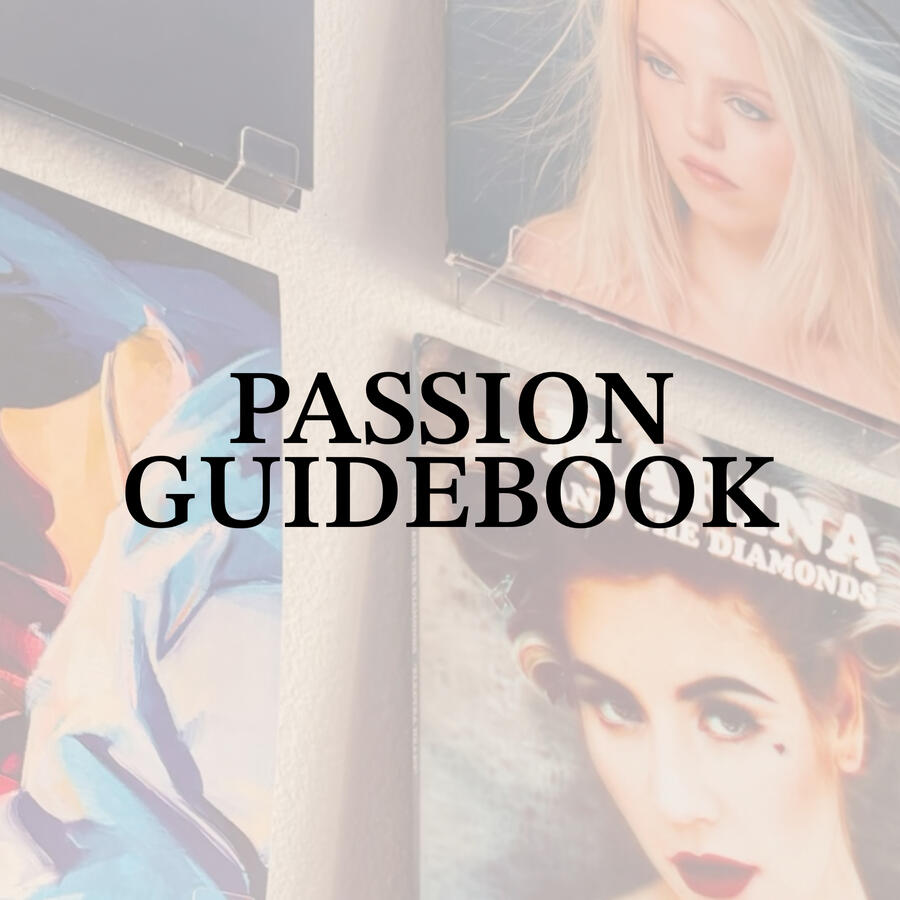
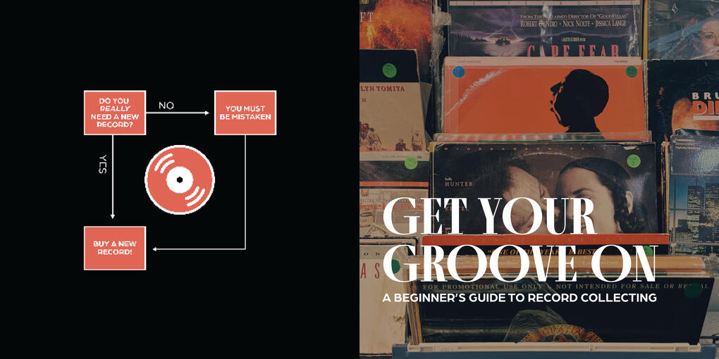
PASSION GUIDEBOOK
This project was all about creating visual rhythm using lots of typography by creating an 8x8 guidebook about a passion of mine, using content we produced ourselves. I paid special attention to detail to the text in this book, but also created a cohesive color pallete, font pairings, and an icon system to create multiple layouts that are unique but come together to create that seamless visual rhythm.
pee pee
PROCESS - SKETCHES
FINAL APPLICATION
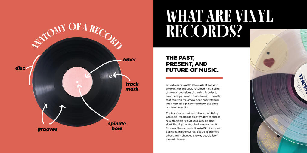
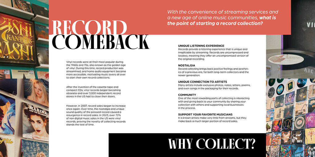
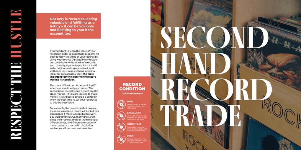
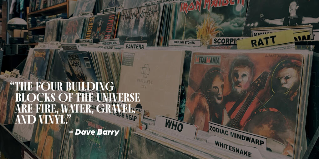
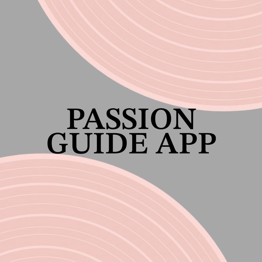
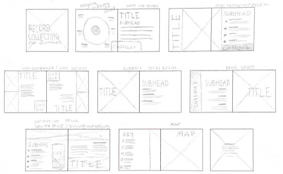
PASSION GUIDE APP
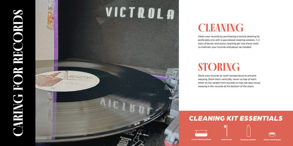
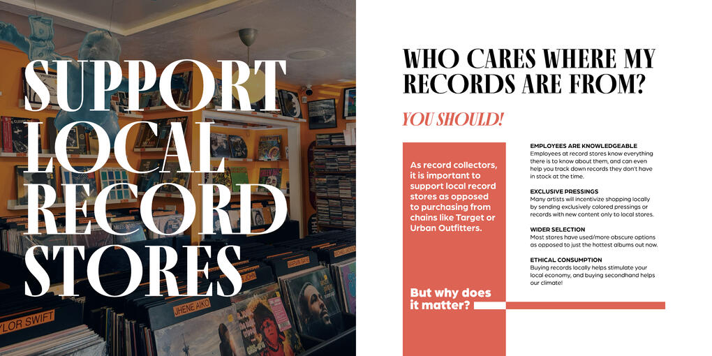
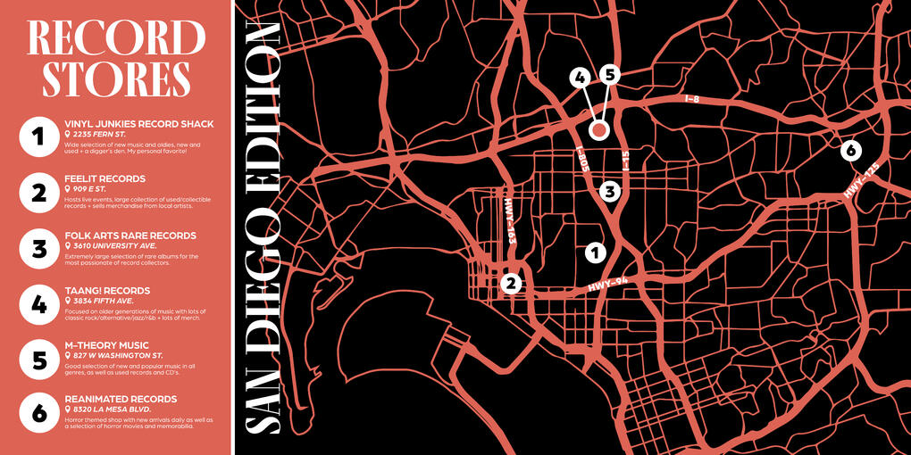
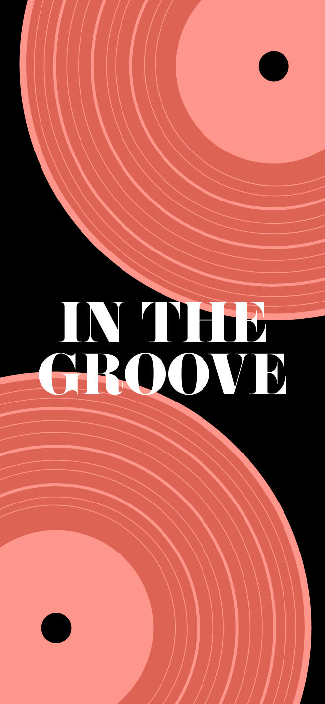
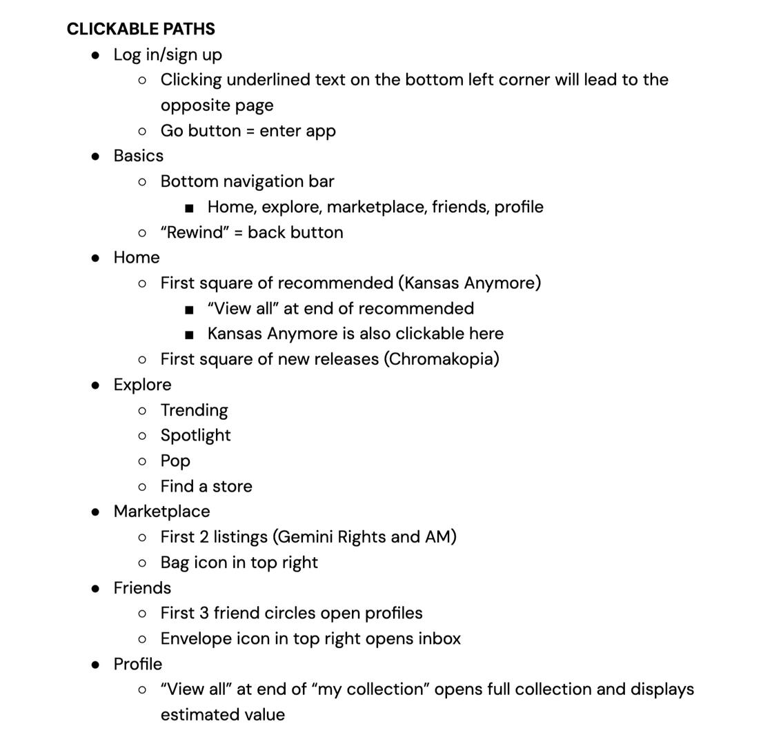
An expansion of the passion guidebook, this project was meant as an introduction to the principles of UI/UX. Using AdobeXD, I created an intricate app prototype for record collectors with a variation of clickable paths and many different screens to optimize an intricately created user experience.You can click the image to view the entire app prototype! I recommend referencing the clickable paths as seen below.
pee pee
DESIGN FOR CHANGE
GRAPHIC DESIGN III - INFOGRAPHICS DESIGN
pee pee
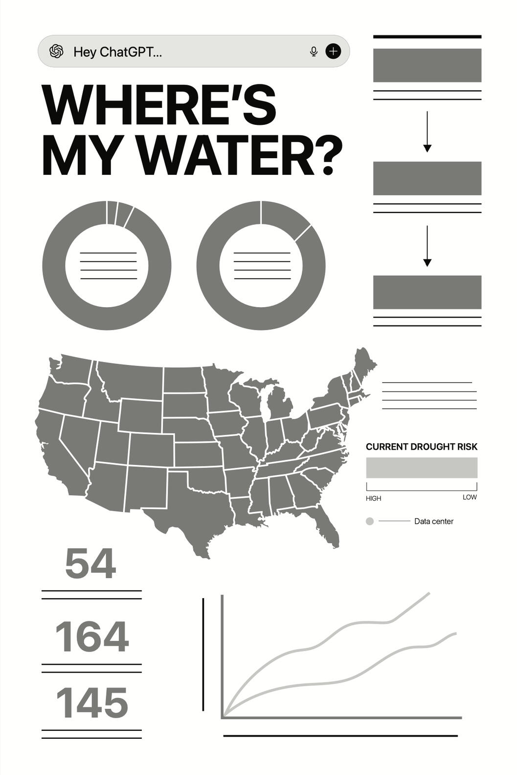
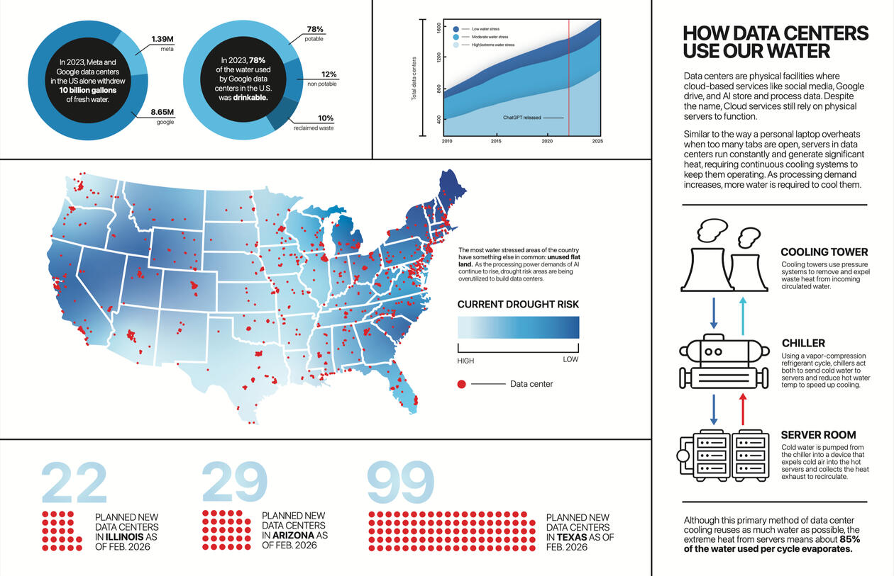
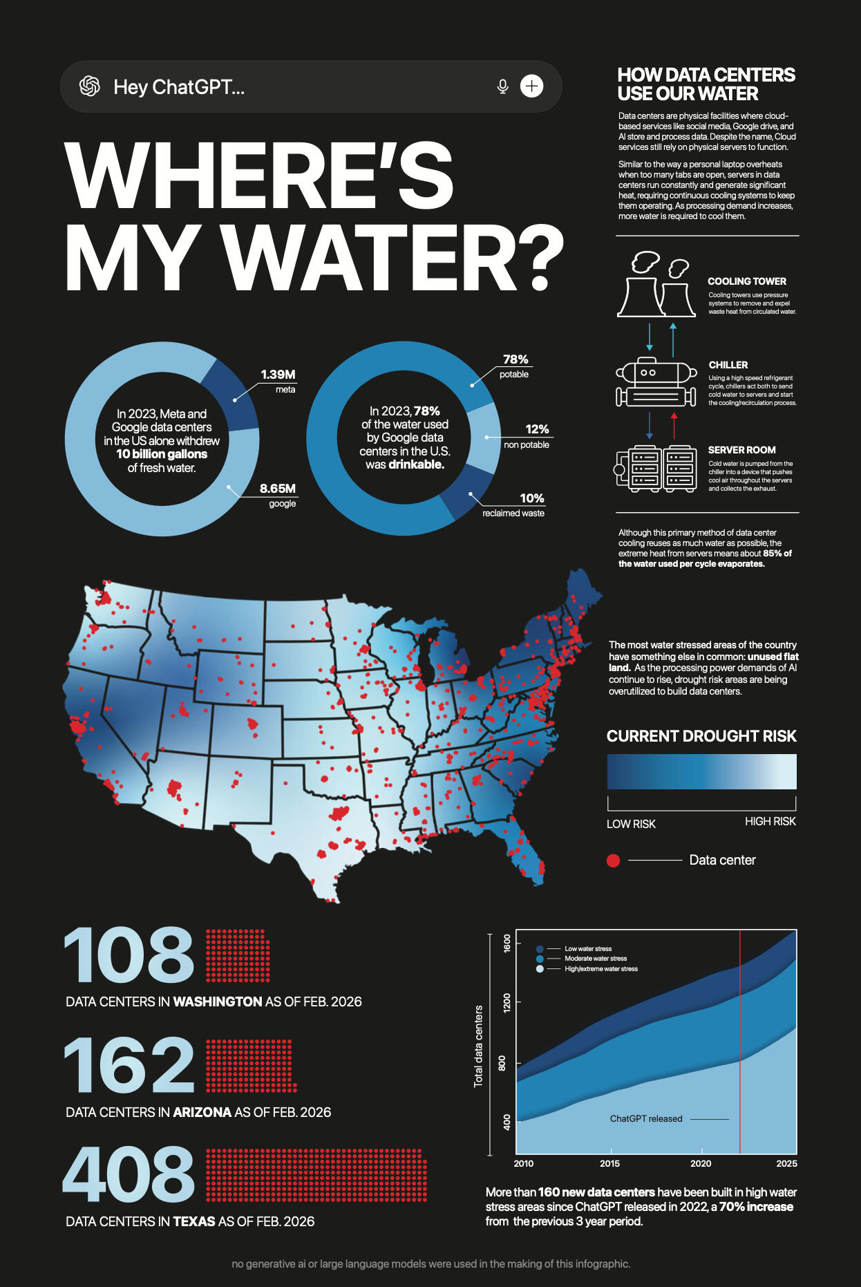
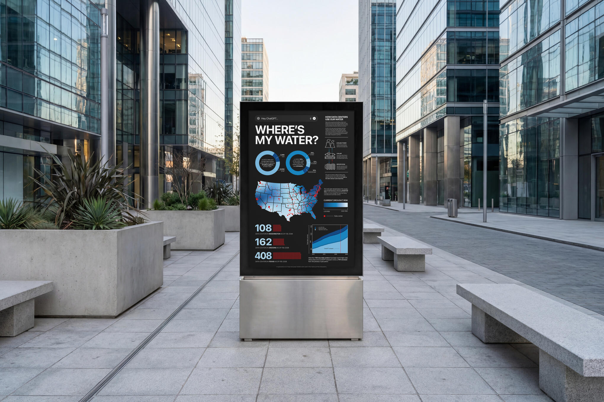
For this project, I was tasked with selecting a topic with an underlying issue and researching it through the lens of creating data driven graphic models that tell a story/create a narrative. I chose to research and create an infographic that raises awareness about how AI data centers are drying up our water supply, as I believe there is low understanding of why this is and it is a pertinent issue at the moment.
pee pee
PROCESS
Original sitemap and first draft graphic models
FINAL DESIGN
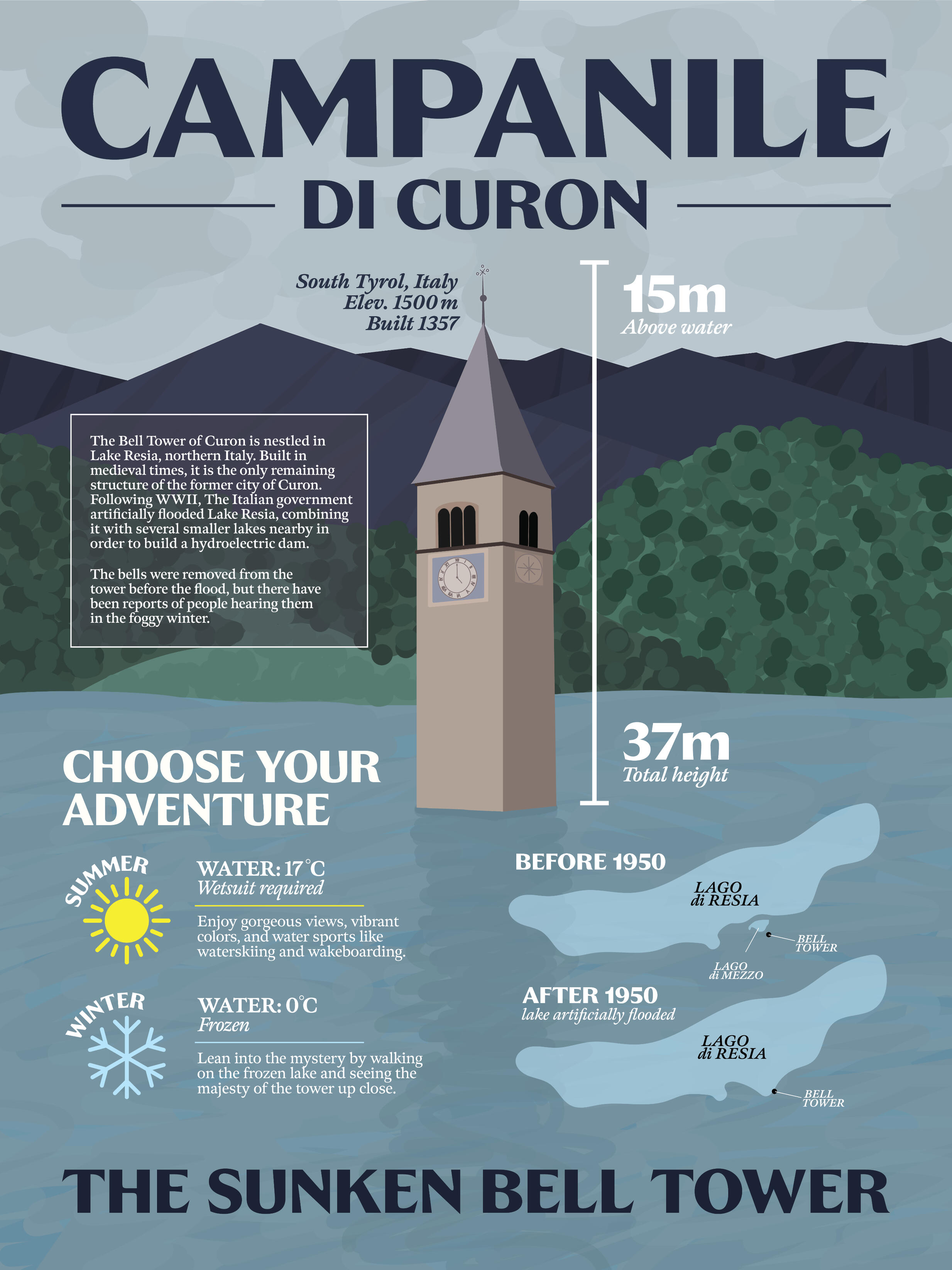
REMARKABLE LANDMARKS
GRAPHIC DESIGN III - INFOGRAPHICS DESIGN
pee pee
This project is all about creating a data driven story about a unique landmark. I chose to create my infographic based on the sunken Bell Tower of Curon, a relatively unknown but extremely interesting landmark in South Tyrol, northern Italy. This lone tower carries an aura of mystery and intrigue that I wanted to lean into. Using Illustrator and Procreate, I created a flat but detailed vector graphic translation of the bell tower, with an accompanying layout based on inspiration from vintage National Park posters.
pee pee
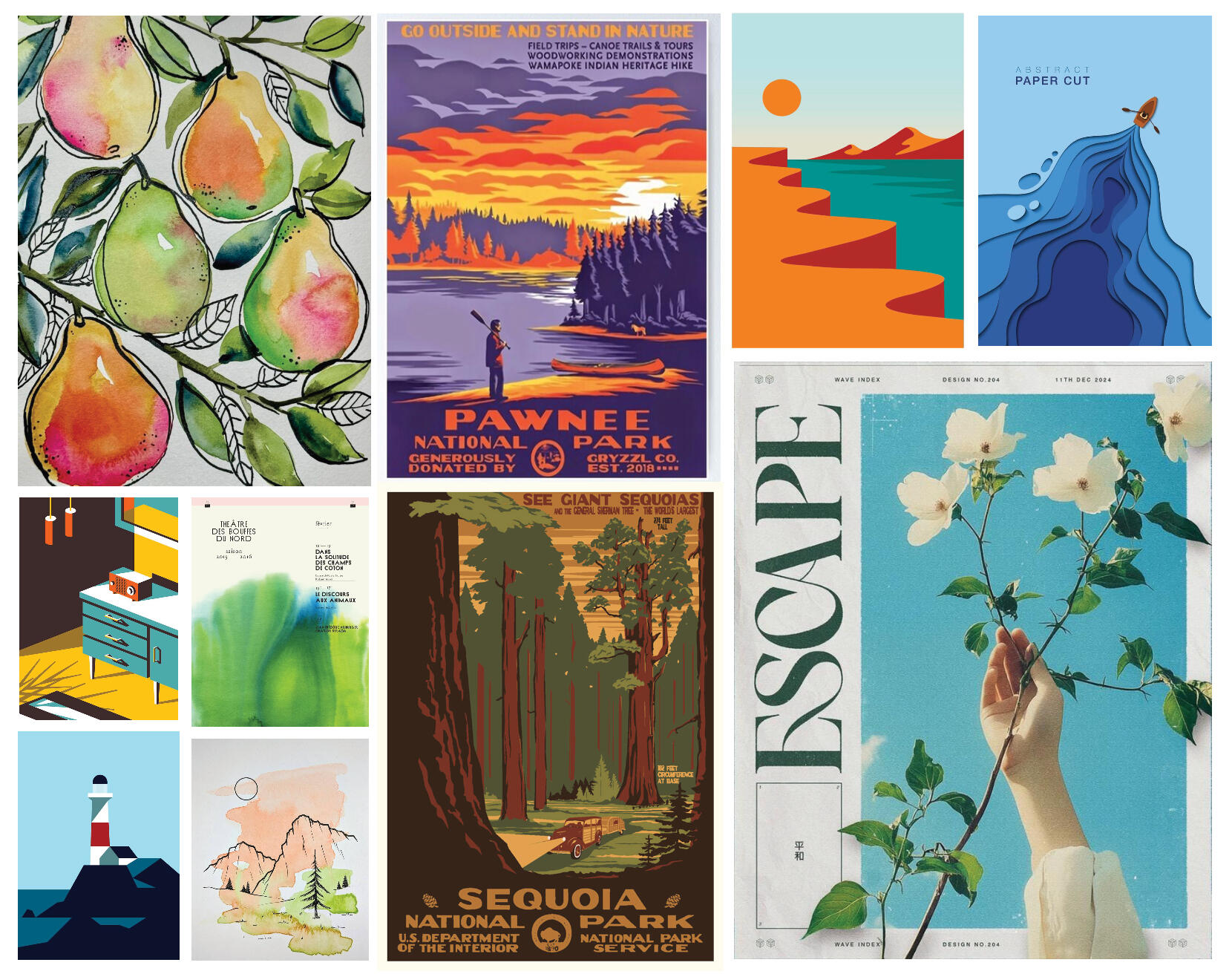
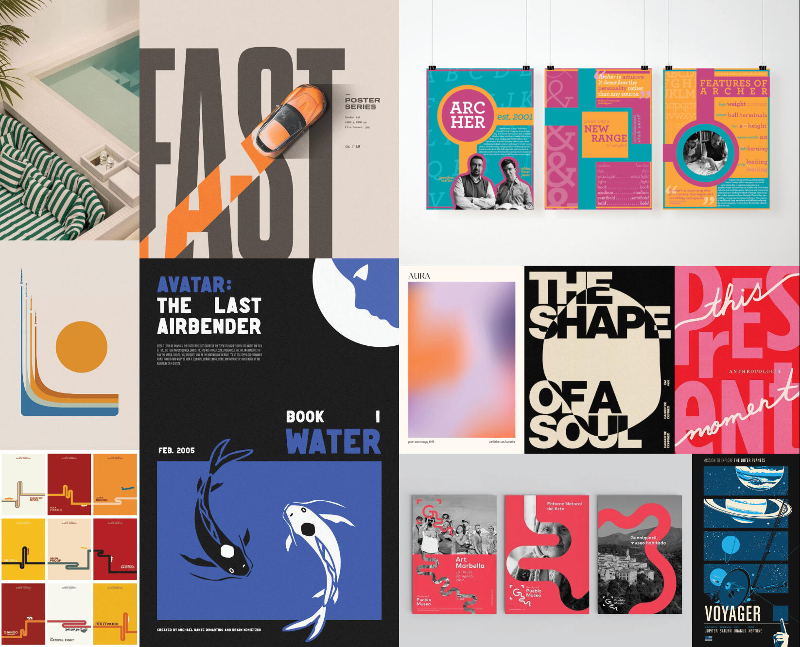
MOODBOARD & INSPIRATION
LAYOUT EXPLORATION / COLOR STUDY
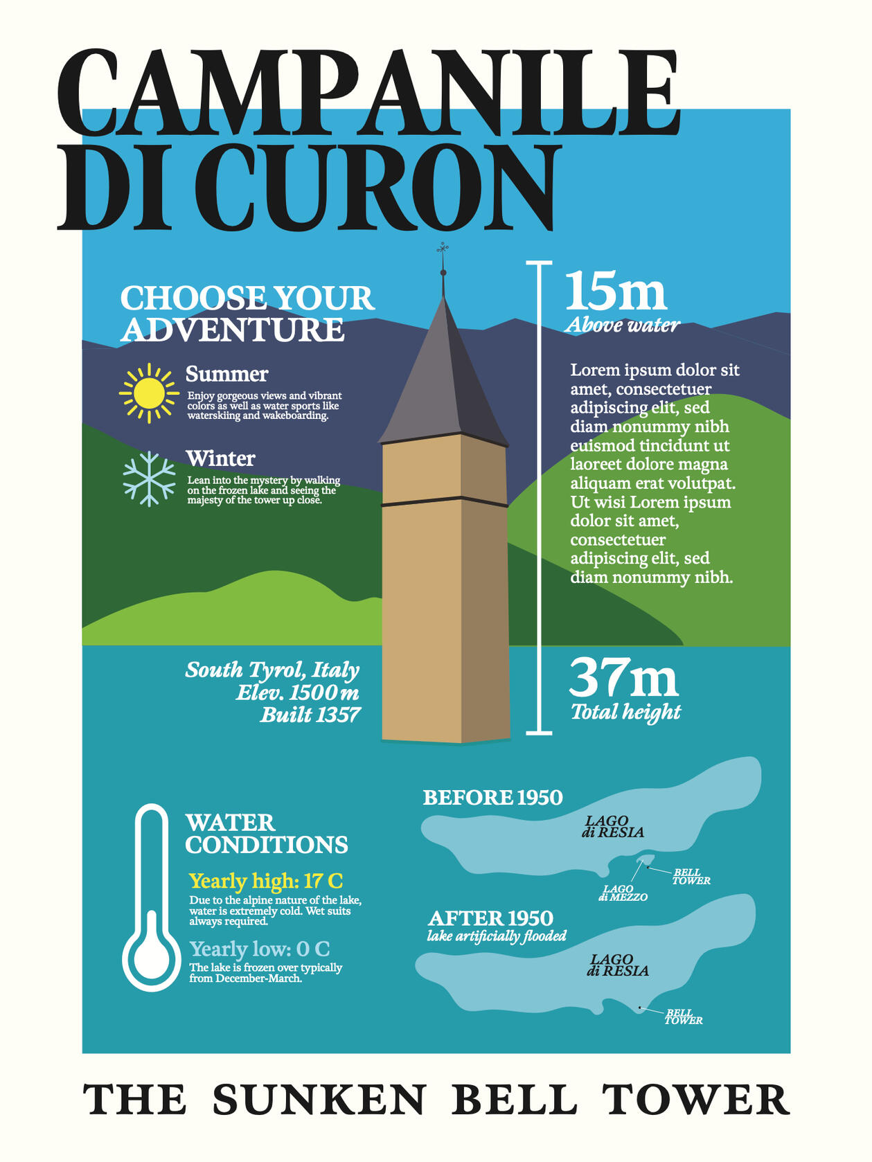
FINAL DESIGN
ERIN HARWOOD
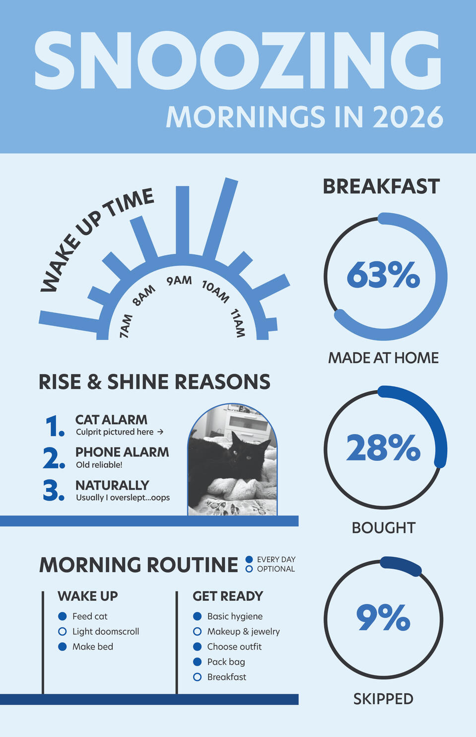
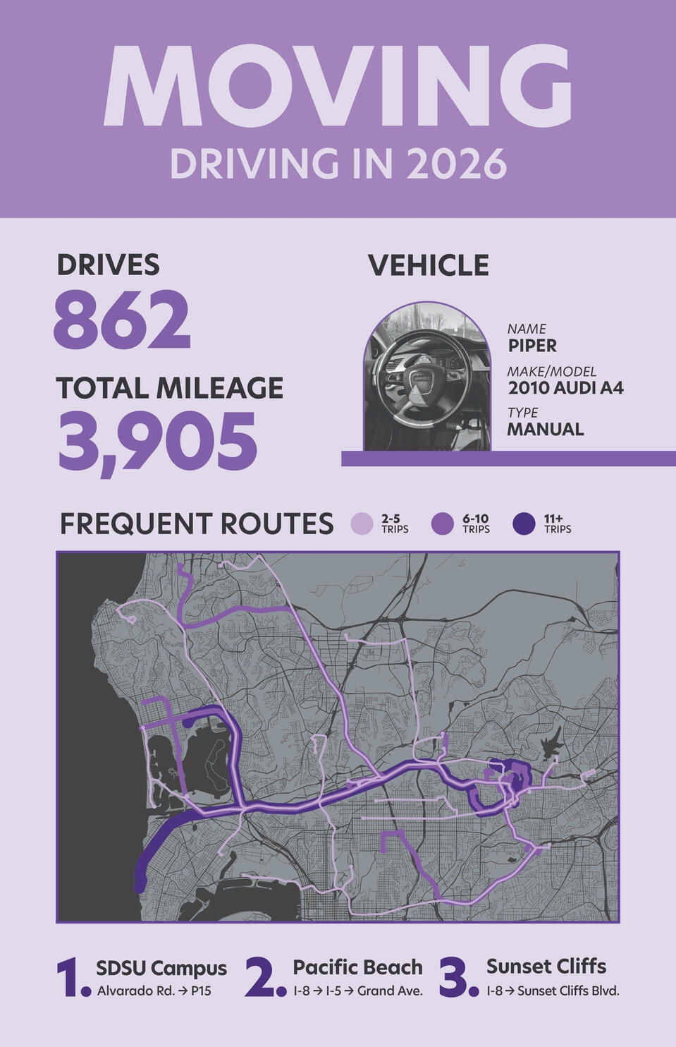
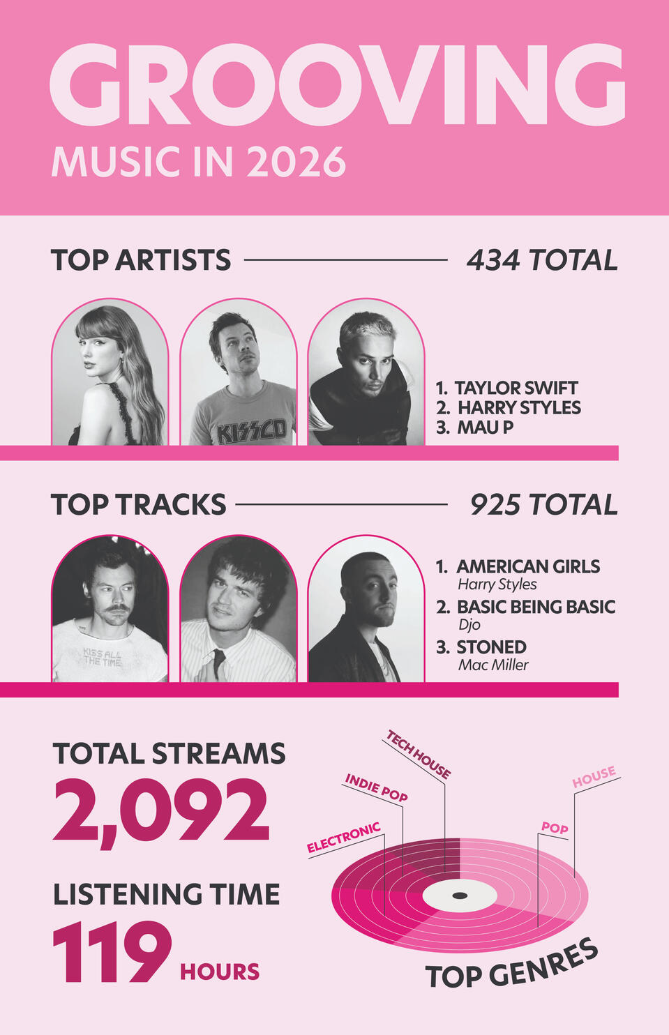
DATA SELFIE
GRAPHIC DESIGN III - INFORMATION DESIGN
pee pee
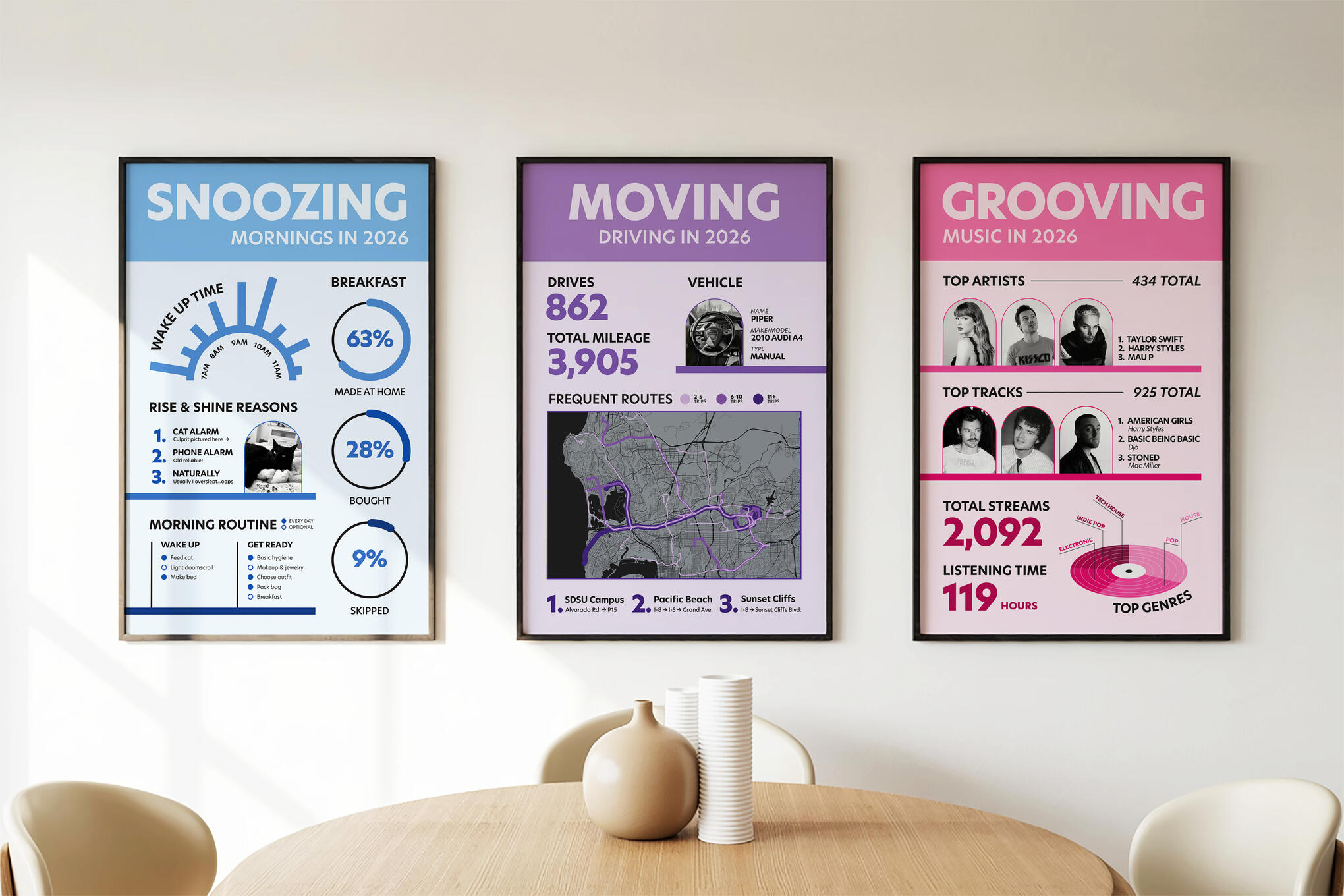
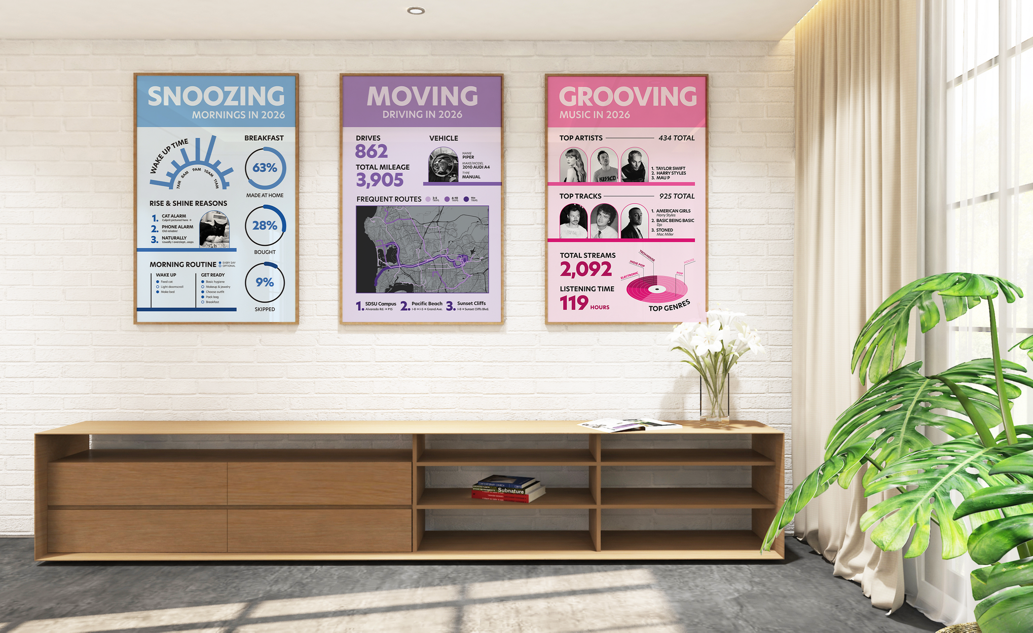
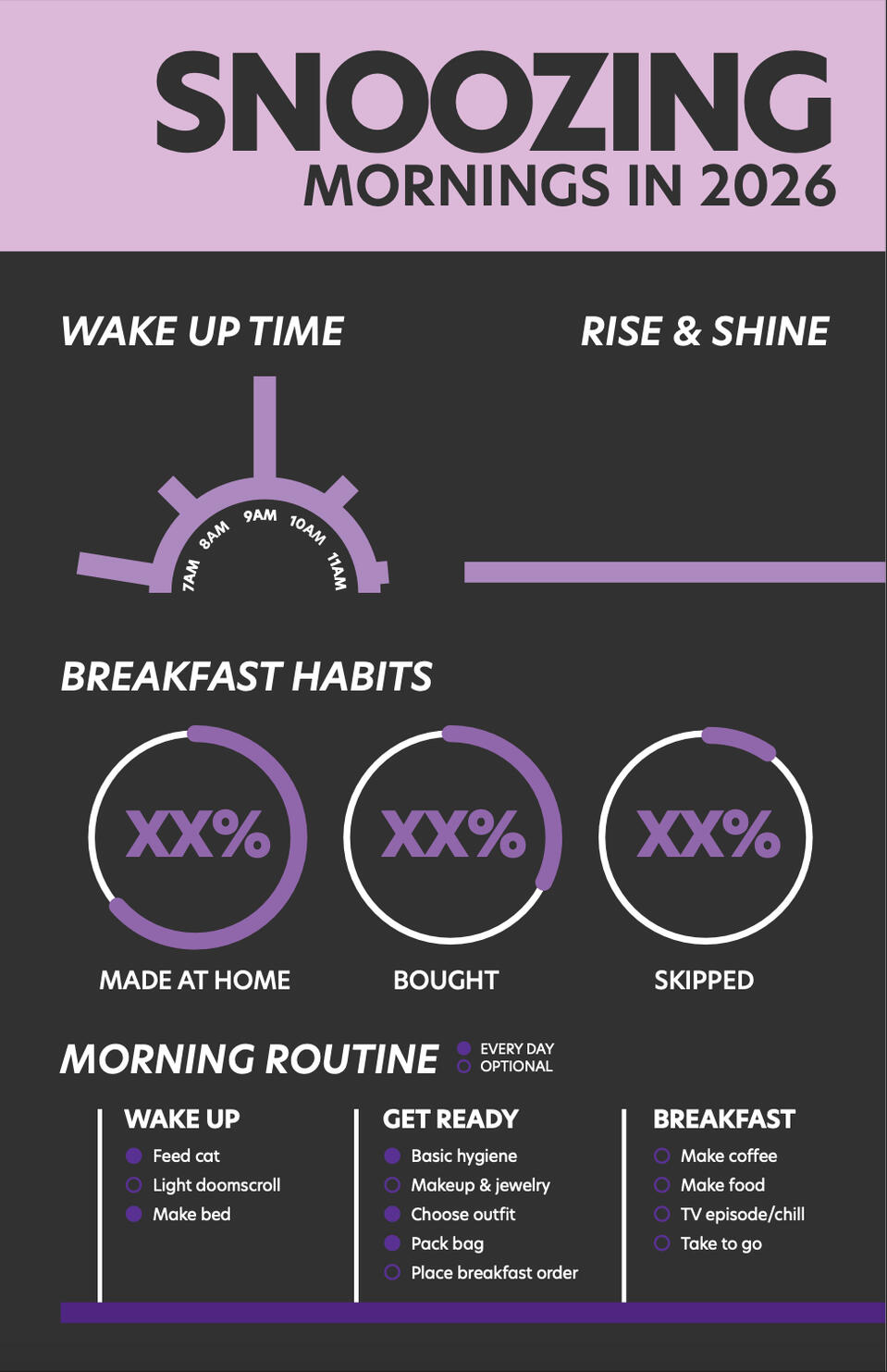
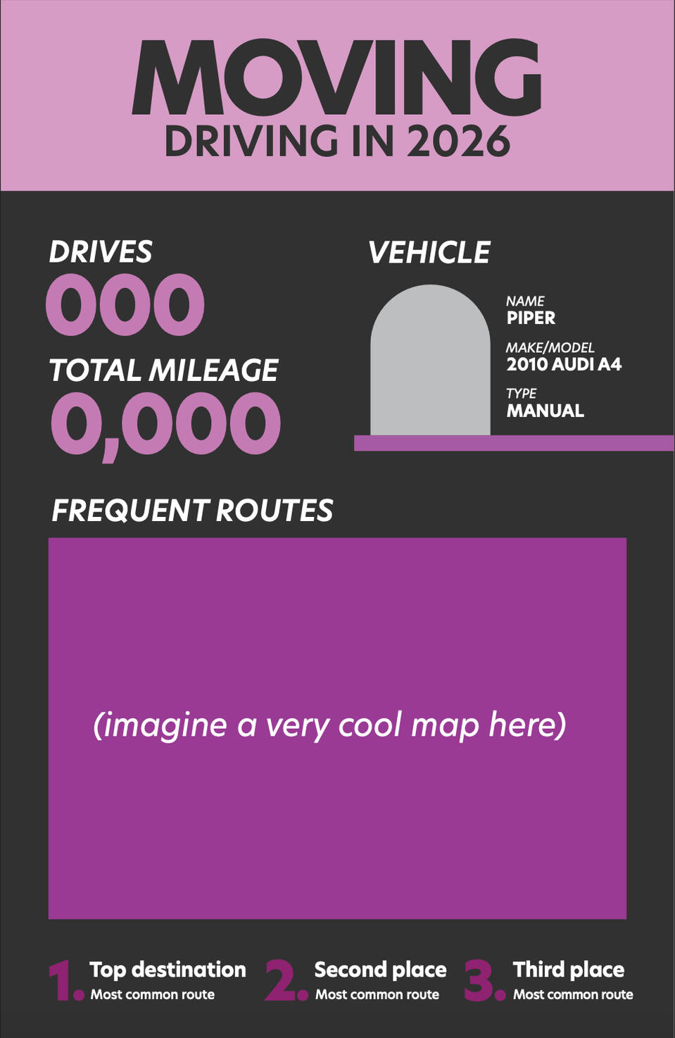
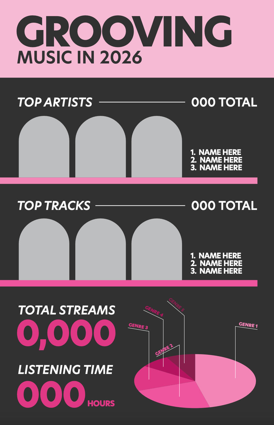
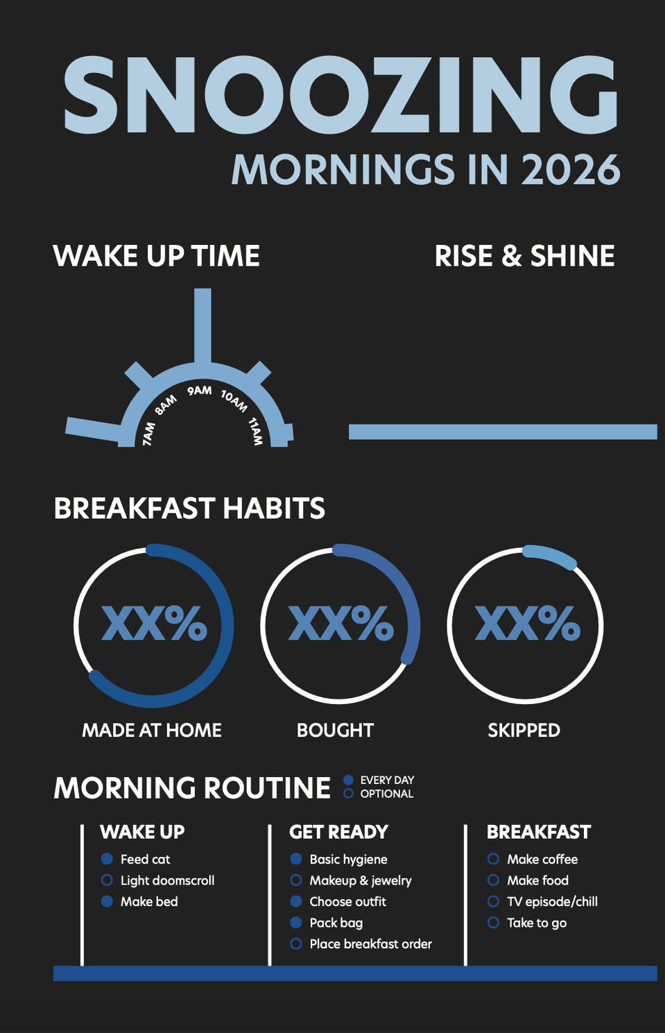
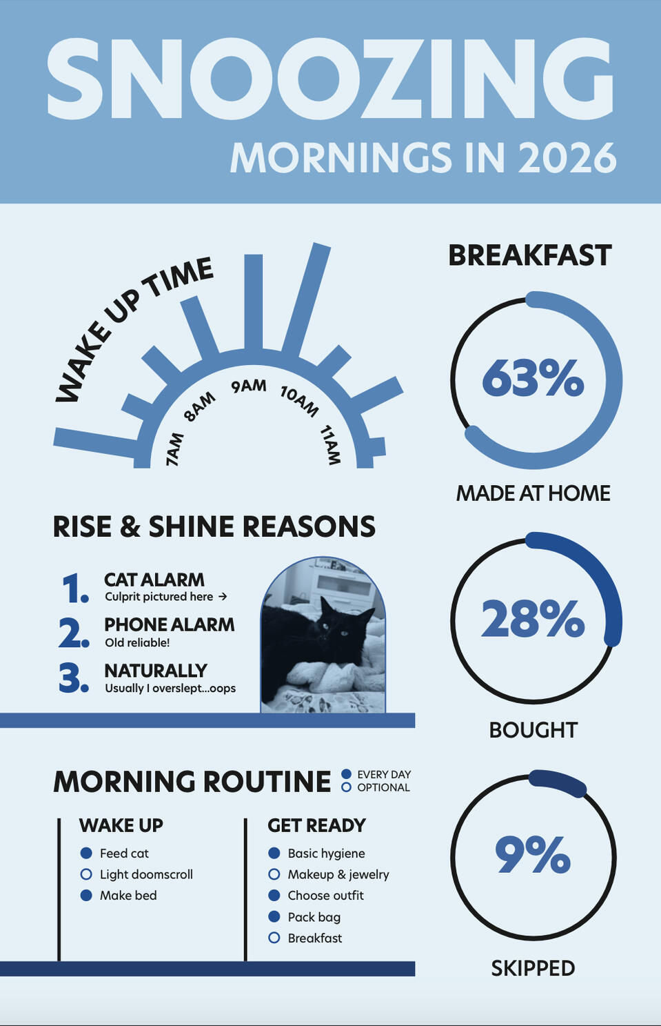
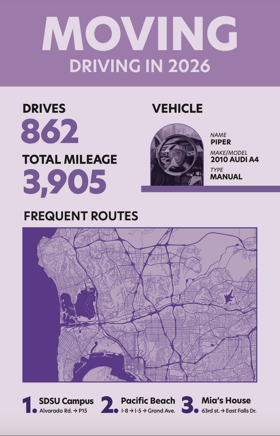
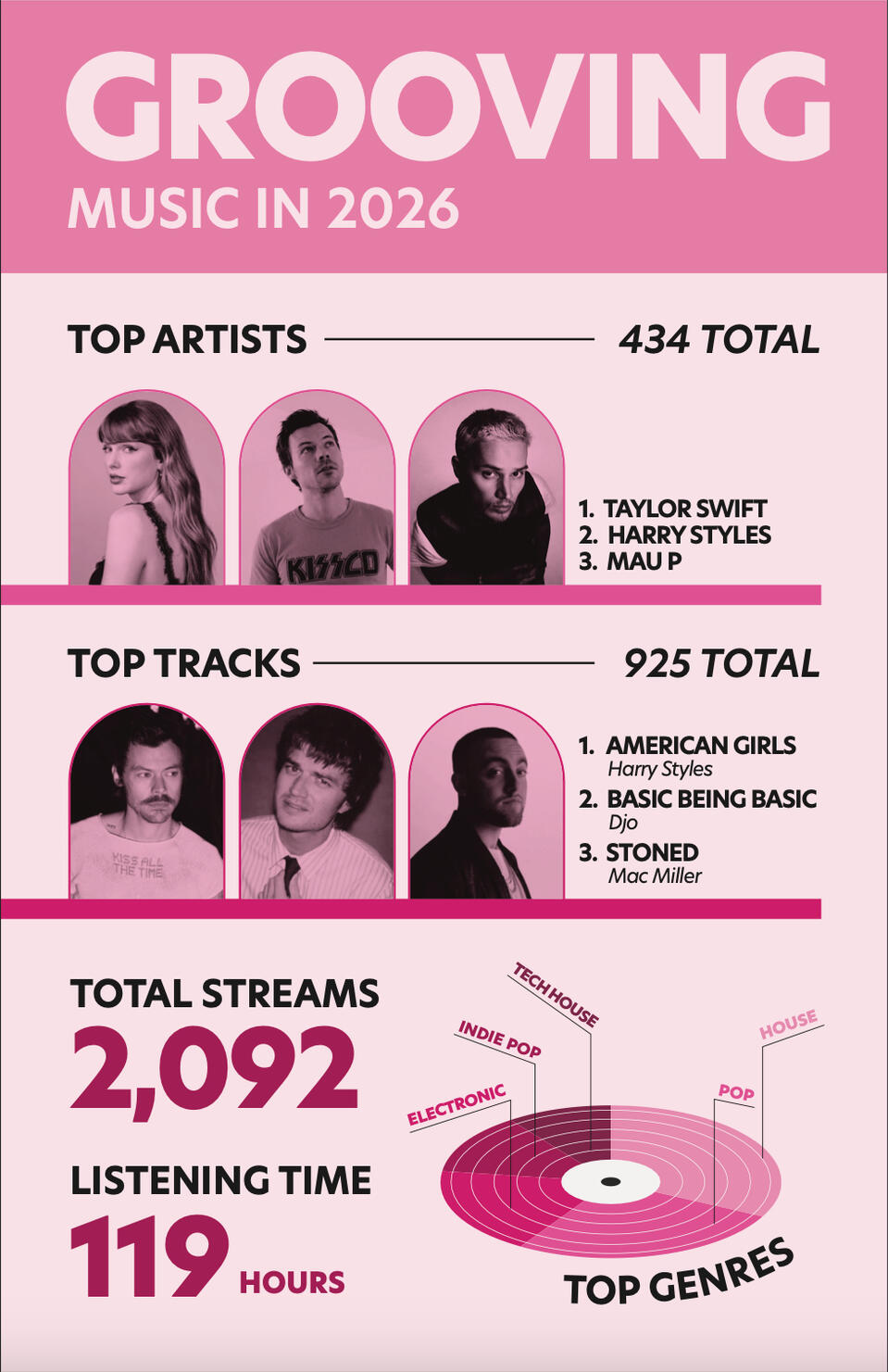
The project objective for this data selfie is to create a set of 3 posters that represent a self portrait using quantitative data. I saw this as an opportunity to showcase my collection of self tracked data. I ultimately wanted to cater to my own taste in the design process to further lean into the idea of a self portrait in infographic form. I ended with a final product of 3 posters that have their own individual narratives but are better together, sharing subtle similarities and differences that reach a harmonious composition.
pee pee
MOODBOARD & INSPIRATION
INITIAL EXPLORATIONS
REFINEMENTS
FINAL DESIGN